It is undeniable we live in a world that is full of data. Our field, digital marketing, is one of the sectors that heavily utilizes data to gain insights and drive business growth. However, sorting through large amounts of data is difficult!
Data visualization tools, like Looker Studio, Power BI, and Tableau, help simplify data by creating clear visuals.
In this article, we will compare these tools based on 7 features using a 5-point rating system and a weighted decision matrix. A summary table will determine the best tool for a digital marketing agency environment.
Get to know each tool:
Before we look at the features, below is a short introduction to each of the three tools and their histories 
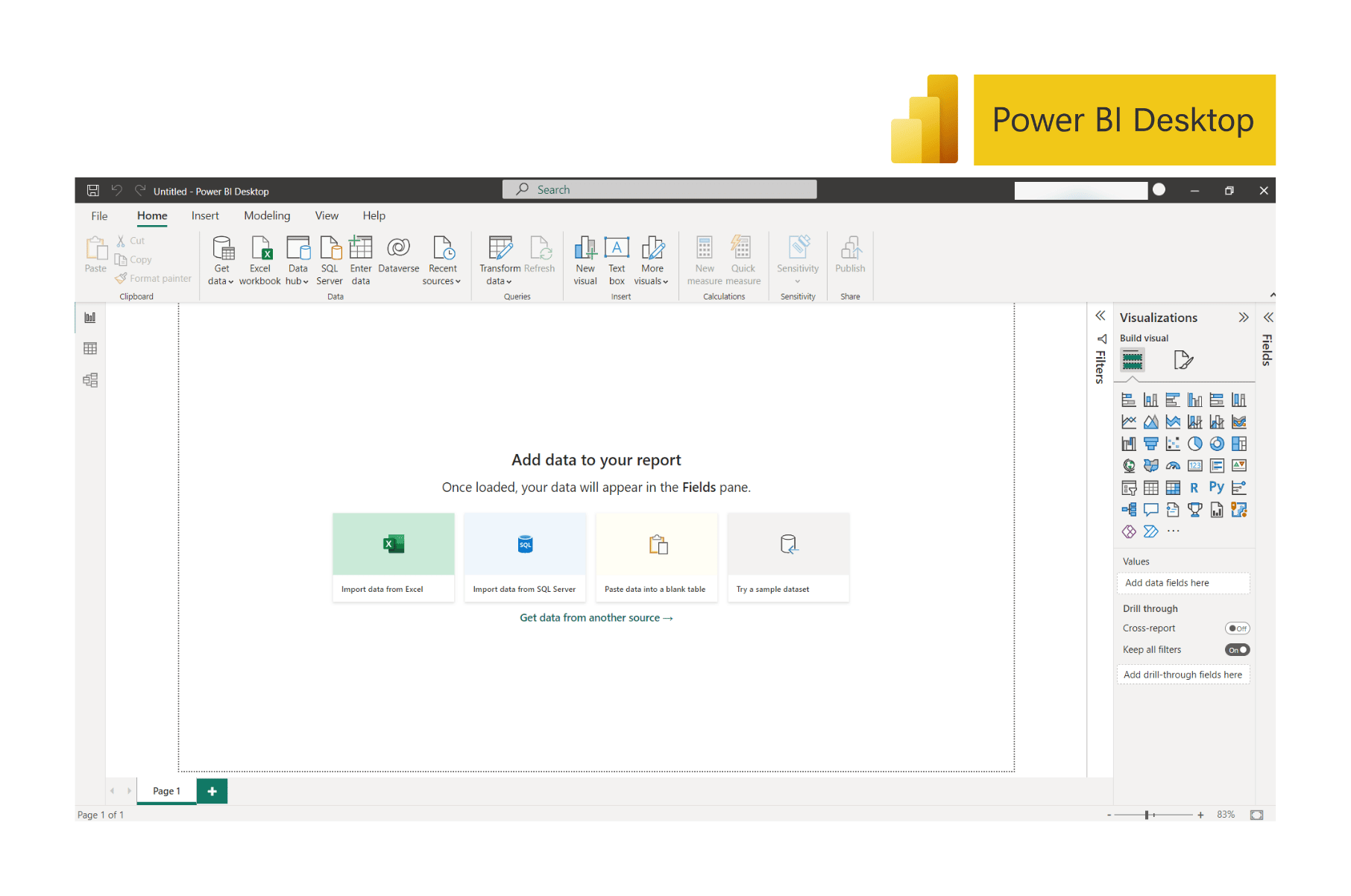
Power BI
Power BI is a business intelligence and data visualization tool for converting data from various sources into reports or dashboards. At first, it was named Project Crescent, which was designed by a team at Microsoft and available for public download in 2011. Later it was renamed to Power BI for Office 365 and unveiled by Microsoft in 2013.

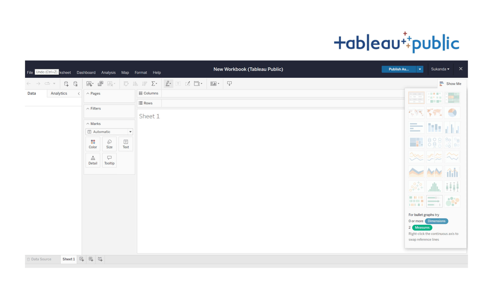
Tableau
Tableau is a business intelligence and data visualization tool for data analysis that helps simplify large volumes of raw data into understandable worksheets and dashboards. It was first launched in 2003 by Tableau Software; a software company in the US and has since been acquired by Salesforce in 2019.

Looker Studio
Looker Studio is a cloud-based and open-source data visualization tool that helps turn data into informative, easy-to-read, easy-to-share, and customized reports and dashboards. It was launched by Google in March 2016 as a part of the Google Analytics 360 suite under the name “Google Data Studio”. In October 2022, it was rebranded to Looker Studio and became a part of the Google Marketing Platform.

Comparison of 7 key features
1. Device & OS Compatibility (Weight 20%)
(Power BI – 4 | Tableau – 5 | Looker Studio – 5)
When considering which data visualization tool to use, it’s important to make sure that the tool is compatible with your device’s operating system, with the most popular operating systems being Mac OS and Windows OS.
All three tools, Looker Studio, Power BI, and Tableau, are compatible with Windows OS. Looker Studio and Tableau also support Mac OS, while Power BI is the only tool that does not currently support Mac OS. So, if you are using a Mac OS device and looking to use any of these tools, Looker Studio or Tableau might be the best choice for you.

Looker Studio is a cloud-based service and can easily be accessed through a web browser, whereas it’s recommended to use the desktop version for Power BI and Tableau.

Even though Power BI does not support Mac OS, in other ways, if you or your company is using other Microsoft products, you could benefit from using Power BI due to it being in the Microsoft ecosystem; for example, familiarity with the user interface or the ease of integrating with other Microsoft products. Like Power BI, the same applies to Looker Studio; users staying in the Google ecosystem may find this visualization tool simpler and more convenient to use.

2. Pricing (Weight 20%)
(Power BI – 3 | Tableau – 2 | Looker Studio – 5)
When comparing BI tools, one important factor to consider is pricing. Each tool may have multiple pricing options.
Looker Studio stands out when it comes to cost, as it is completely free to use. This makes it a great option for small businesses or startup companies that are just starting to incorporate data visualization into their operations. It could be an ideal choice, as the end-to-end process of creating visualization is free of any cost.
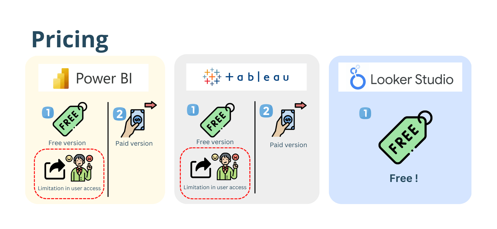
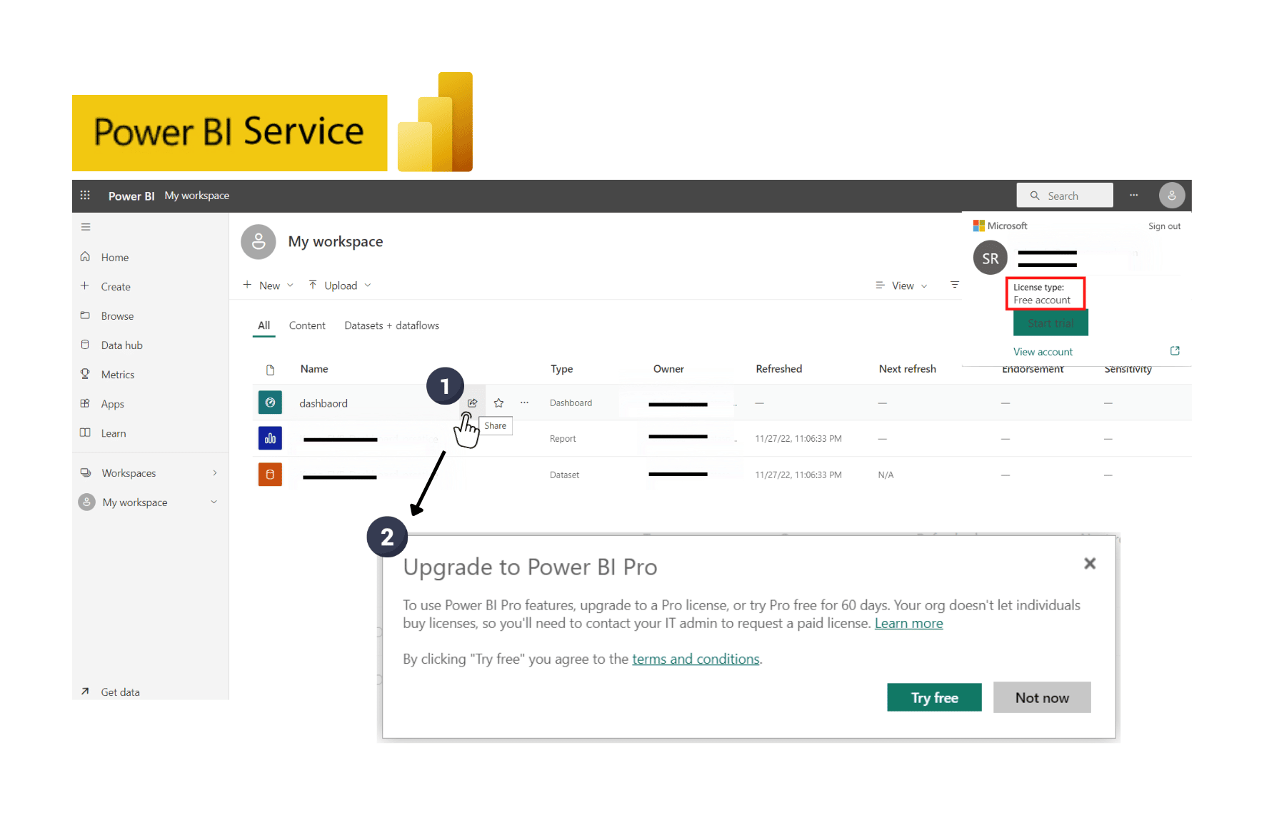
Power BI and Tableau also have a free version for users but they come with limitations in sharing and collaborating capabilities. For example, with the Power BI free license type, you are able to create content but cannot share them with other users, unless you decide to publish them to the public web. Not super convenient if any of the data shown is confidential.
Power BI’s above concept also applies to Tableau as it offers a free version called Tableau Public which can only be accessed through a website. (https://public.tableau.com). The good: features are the same as the desktop version. The bad: there are limitations in terms of data confidentiality when publishing to the public web.
In conclusion, the free versions of Power BI and Tableau are not suitable for use within a business or for commercial purposes.
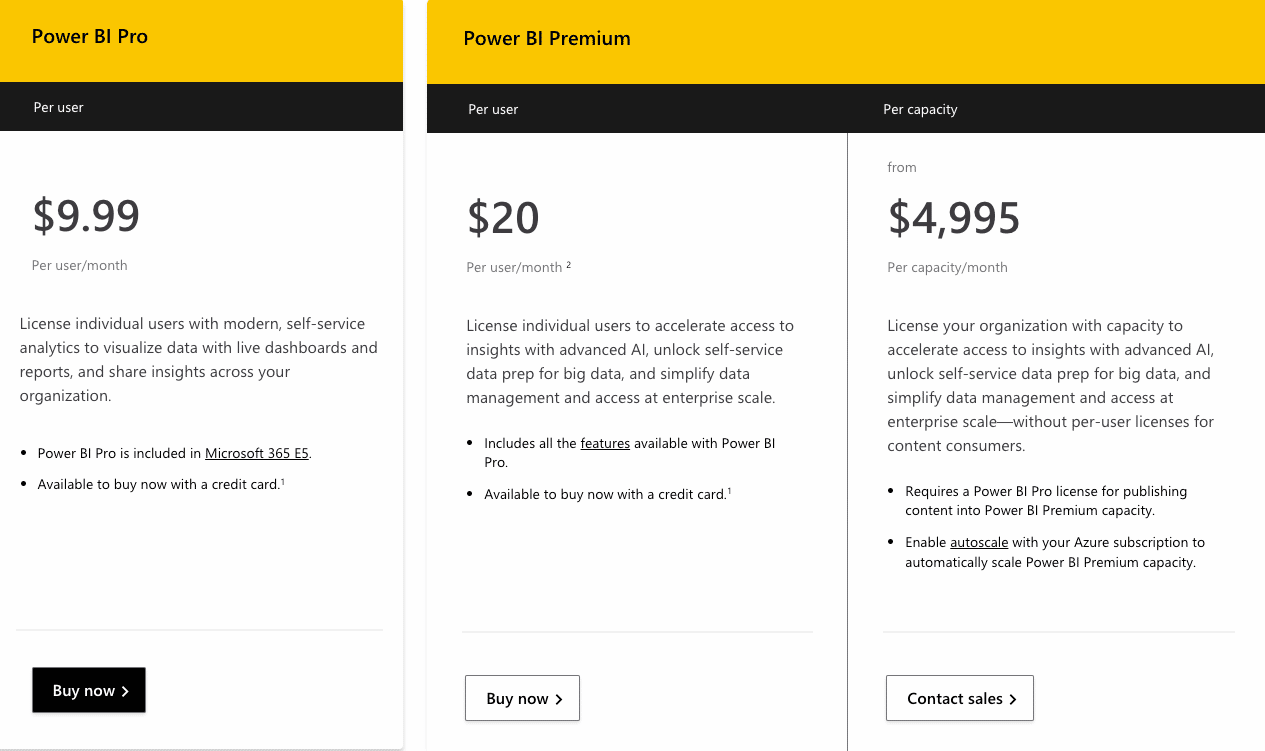
If you choose to go with a paid version, Power BI has two options: an individual user license starting at $9.99 per month per user, and an organization license at $4,995 per month per capacity. Tableau’s pricing, on the other hand, is based on the specific needs of the user.
The cheapest one is Tableau Viewer license costing $15 per month per user for only the ability to view, comment, and interact with dashboards. To create content, it’s required to subscribe to Tableau explorer license at $42 per month per user, with the cost potentially adding up to $70 per month per user if you would like to prepare data within Tableau Prep Builder by subscribing to Tableau creator license.
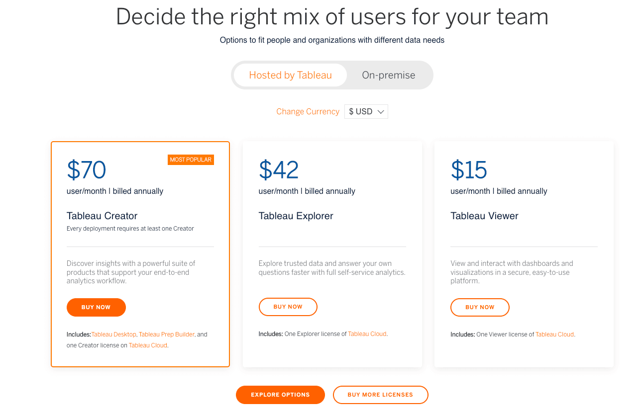
And so, for dashboard creation, Power BI is cheaper than Tableau. But again, Looker Studio is (for now) free.
It’s important to keep in mind that comparing the pricing, or cost, of these tools is crucial for any organization that wants to select the best fit for them. Depending on the scale, functionality and usage of the organization can make one tool more or less appealing in terms of cost.
3. User Access (Weight 20%)
(Power BI – 2 | Tableau – 3 | Looker Studio – 4)
Say, like us, you serve multiple clients. The share feature should definitely be a factor taken into consideration as dashboards may contain sensitive information
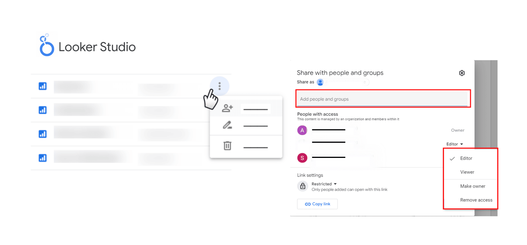
Sharing and collaborating on Looker Studio is easy to do as you can share your reports or dashboards to external users by entering their email address. Actually, this is easy for both internal and external sharing. One constraint is that it requires a person to have a Google account, such as a Gmail account, to get shared.
When it comes to sharing Power BI reports, there is an extra step that needs to be taken. Reports must be published to the Power BI service (app.powerbi.com) first. Additionally, users must have a Pro license to share content, and those who will be viewing the report must also have the same license type. For example, if the person creating the report in your company has a Power BI Pro license, your clients must also have Pro licenses in order to interact with the dashboards. The downside of this is that it can be an added complexity for clients, as they are required to pay for a license to access the information.
Additionally, for Power BI, another way to share content with external users is to purchase a Premium capacity license type for the company. However, this approach comes with a large cost at almost $5,000 per month – not worth it if your organization is relatively small.
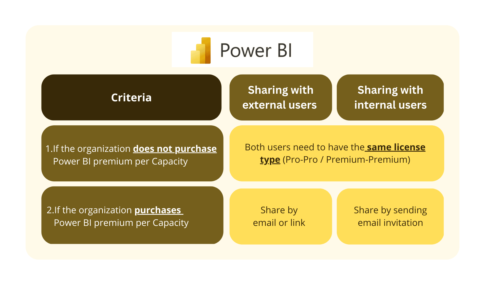
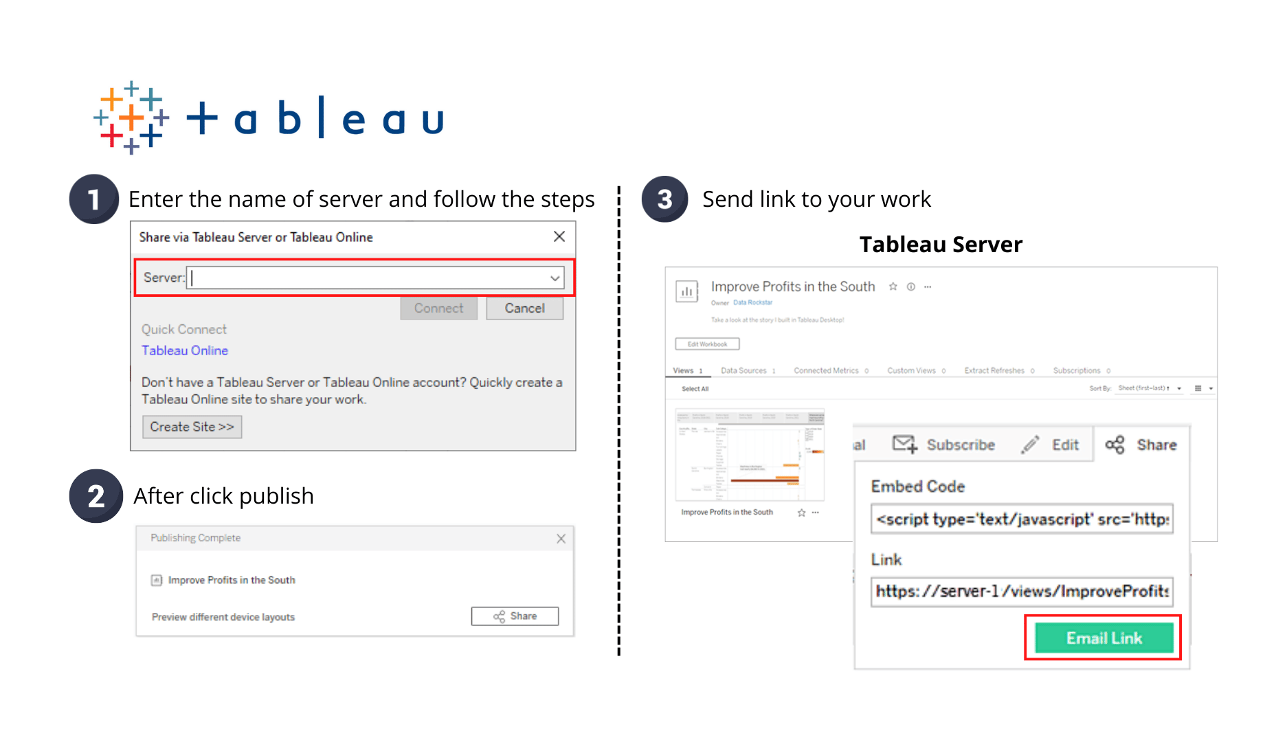
For Tableau, sharing is similar to Power BI but more straightforward: first, you need to publish worksheets to Tableau Server, then you can share the visualizations with other people by sending a link or an email. Just remember: clients – or external users – need at least a Tableau Viewer license.
4. Load Speed and Tool Stability (Weight 12.5%)
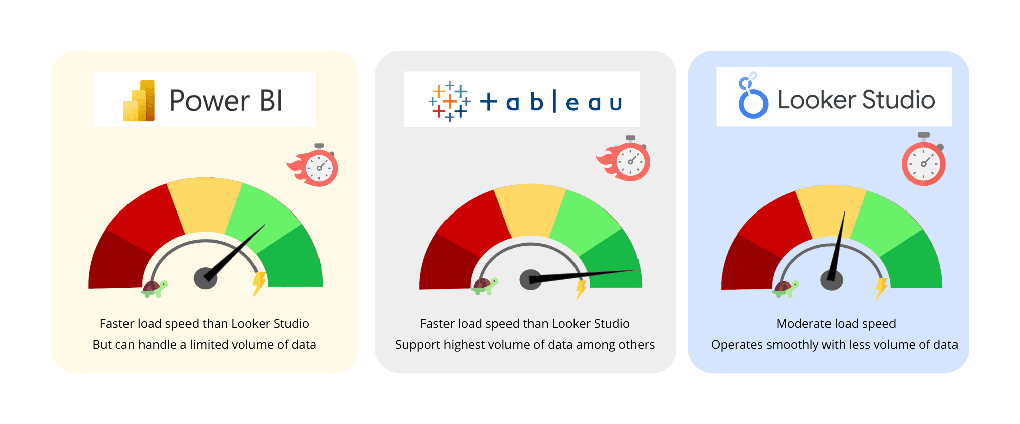
(Power BI – 4 | Tableau – 5 | Looker Studio – 2)
When it comes to the three BI tools, load speed is a crucial factor, as no one wants to wait around for a dashboard to load.
Looker Studio falls behind the other two options. The more functions or components you add to your report, like visualizations, icons, or large amounts of data (like 100,000 or more rows), the slower the report will become. When using Looker Studio, you may need to refresh the screen more frequently to keep the tool stable.
On the other hand, Power BI and Tableau are better options for load speed and smooth interactions among visualizations. These tools are also more stable and can handle large amounts of data without any errors. So, if you’re looking for a fast and stable tool, Power BI or Tableau might be the better choice for you.
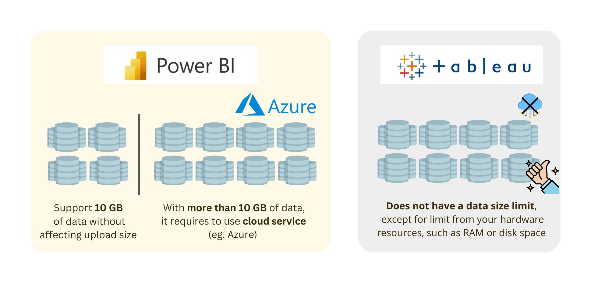
If comparing between tools looking purely at the maximum volumes of data they could support, Tableau outperforms Power BI, as Power BI can handle a limited volume of data at only 10 GB unless it’s required to use a cloud service like Azure; Tableau does not have a data size limit and can handle as much data as your local storage can handle without any requirement for cloud service.
5. Visualization & Customization (Weight 12.5%)
(Power BI – 4 | Tableau – 5 | Looker Studio – 3)
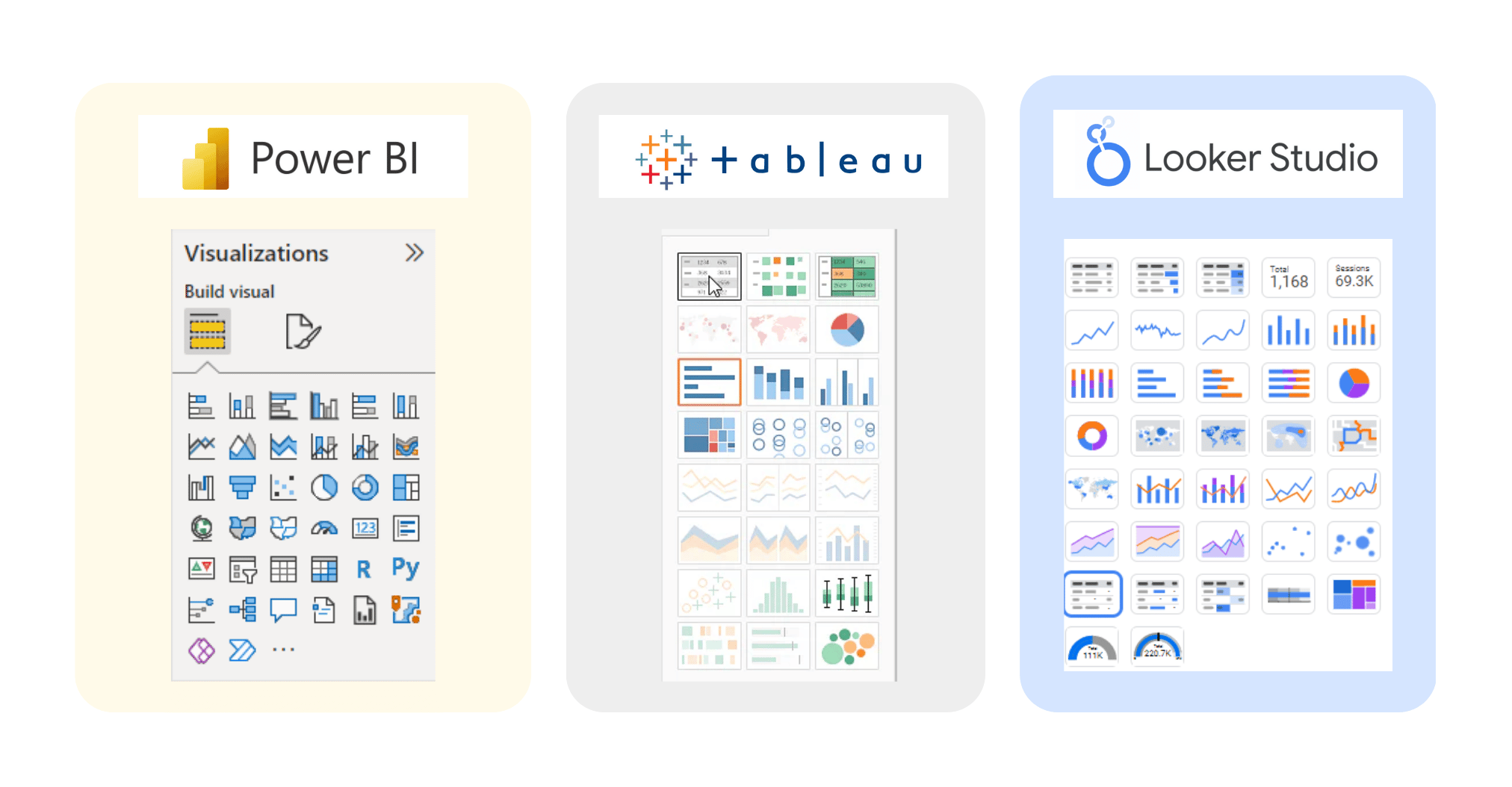
Different specific options of visualization are core criteria for evaluating data visualization tools, as in the name! From a marketing perspective, all three tools, Looker Studio, Power BI, and Tableau, provide in-built basic visualizations that are essential for data analysis. These include charts like bar charts, column charts, combo charts, line charts, pie charts, area charts, heatmap tables, maps, and treemaps.
Apart from types of visualizations, report customization also plays an important role to make visuals look nice and more appealing. Below is a small breakdown of specific customization options per tool:
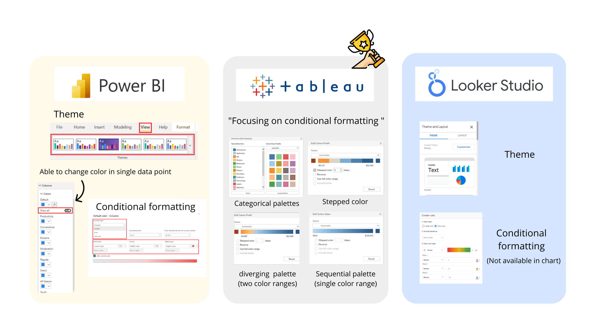
- Color: When it comes to adding color to your reports or dashboards, all three tools offer similar options. Power BI and Looker Studio allow you to set a consistent theme color across the entire report, while Tableau puts more emphasis on conditional formatting. This allows for increased visibility and customization, allowing you to focus on the important aspects of your data. Tableau also provides more granular options, giving you a wide range of color palette options and the ability to adjust the number of stepped colors. It’s worth noting that Looker Studio does not have the option of conditional formatting for certain visualizations like bar charts, and the users can only select a single color representing that data field.
- Size: Within all three tools, you are able to adjust the size of your dashboard and report pages. The size of visualizations is also adjustable, by selecting and dragging frames to freely resize. Additionally, Tableau is more detailed in resizing bars or columns in charts.

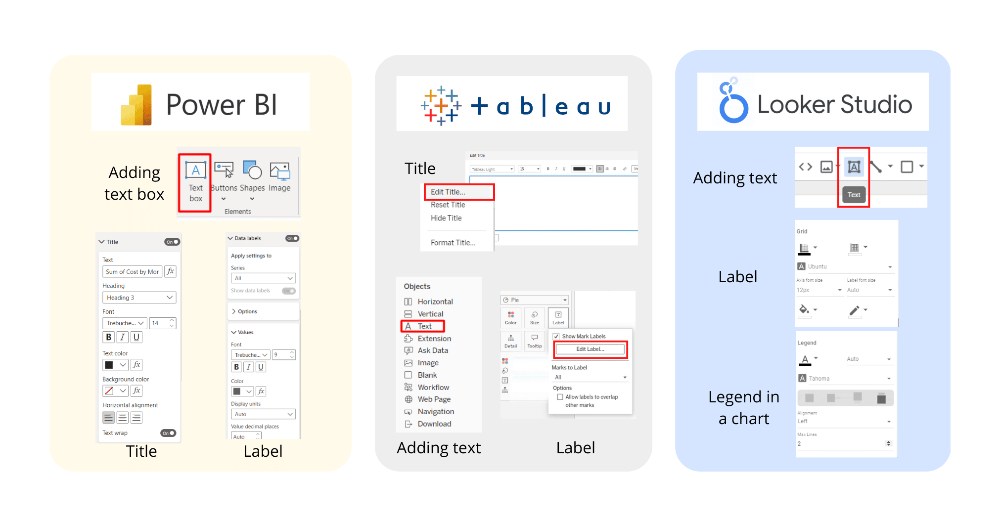
- Text and font: You can add texts and also have several options for font styles and sizes. Additionally, you can make granular adjustments, such as editing titles, labels, or legends separately.
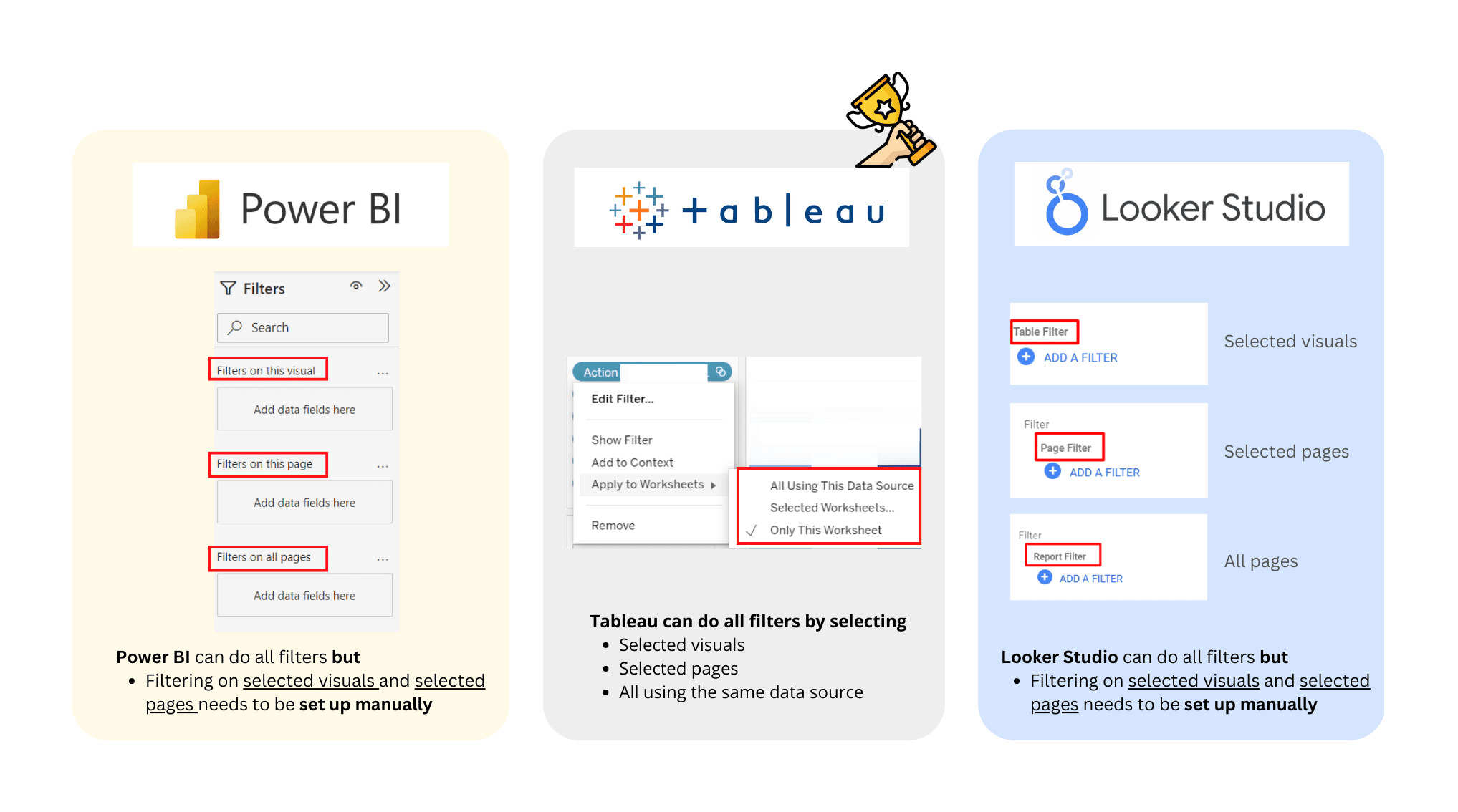
- Filter: The filter feature comprises filtering data on specific visuals, selected pages/reports, and all pages/reports. Tableau has the greatest filter functions as you are able to do everything by selecting. Filtering on specific visuals, or selected pages is also available in Power BI and Looker Studio, but you need to manually add filters to each visualization or each page yourself.
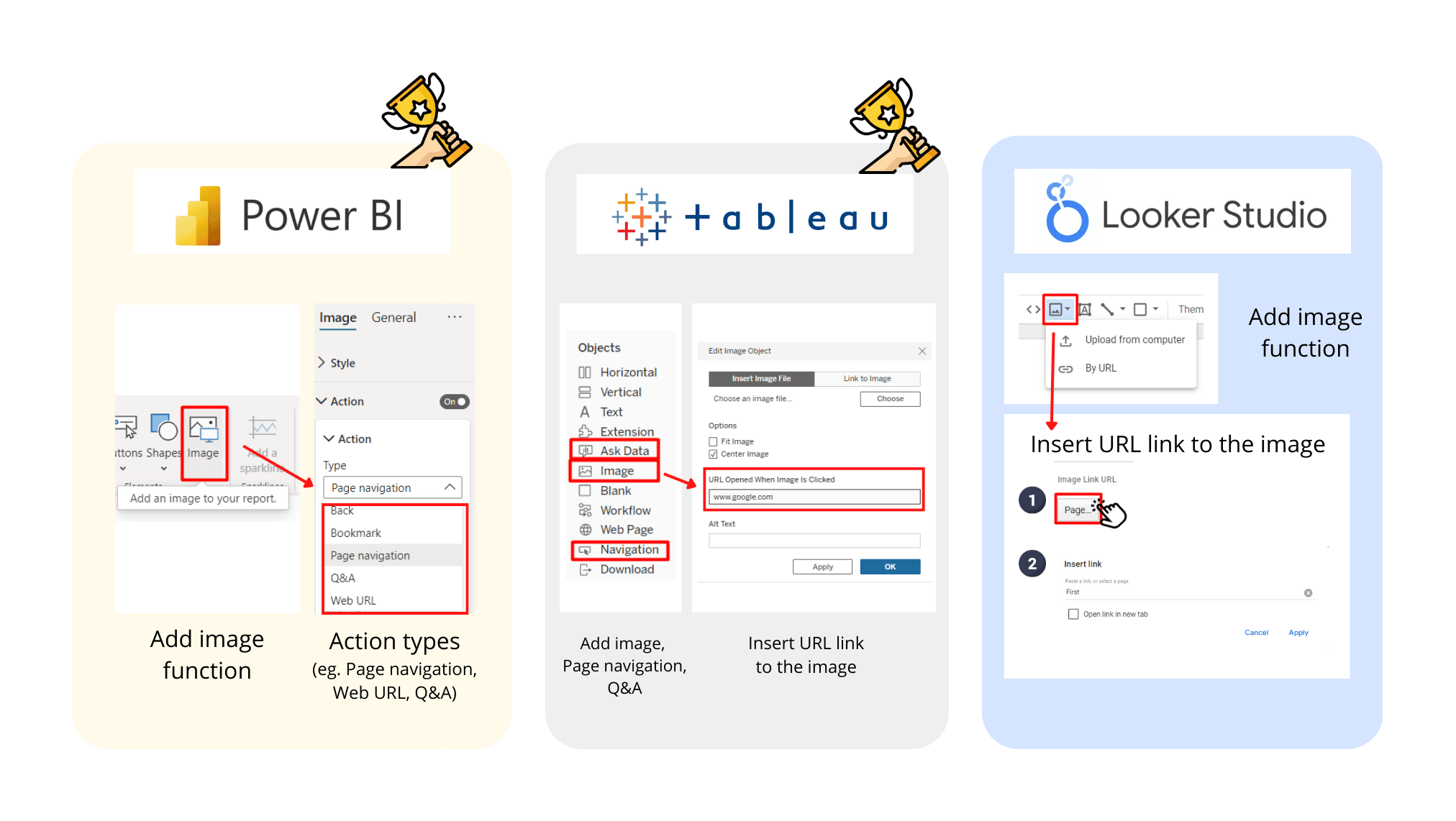
- Images or icons: All three tools allow you to add images and make them clickable to external websites or pages within the reports. Power BI offers additional action types of clickable images, such as asking Q&A. Tableau provides separate features of page navigation and Q&A, in addition to clickable images to external websites.
Overall, all three tools provide enough visualization options for data analysis in digital marketing, however, the granularity of customization varies among the tools; in descending order from Tableau to Power BI to Looker Studio.
6. Use Interface & Navigation (Weight 7.5%)
(Power BI – 4 | Tableau – 3 | Looker Studio – 5)
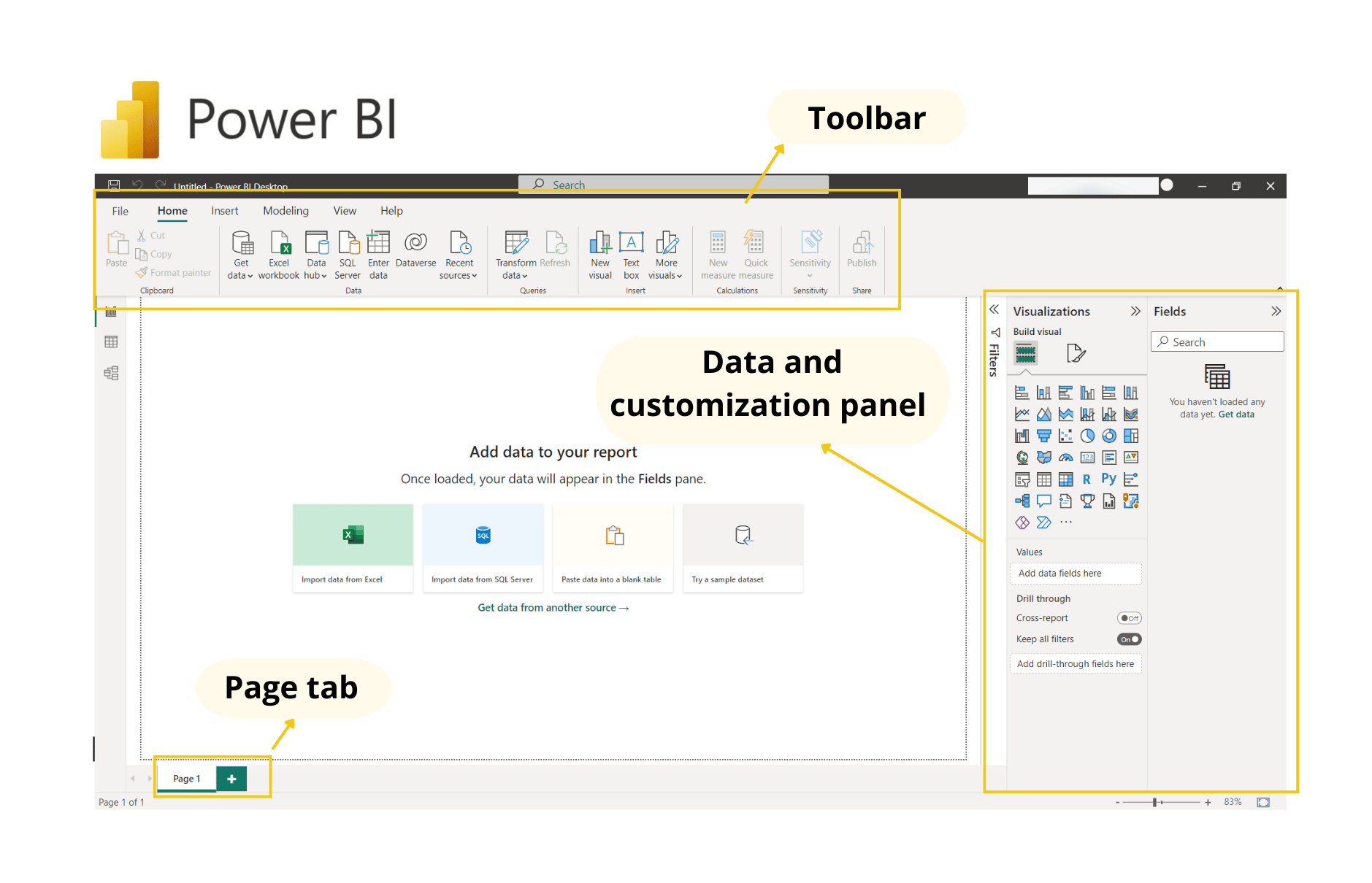
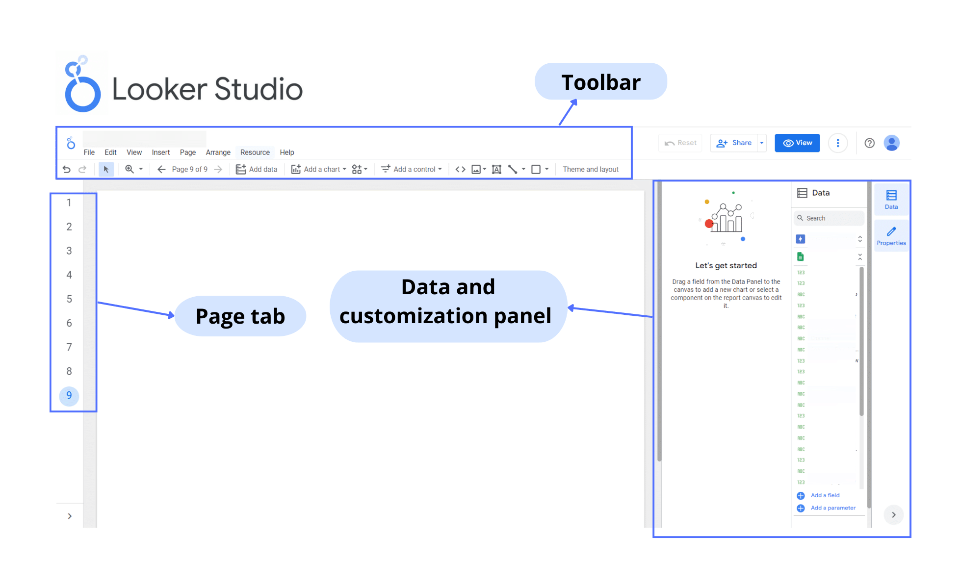
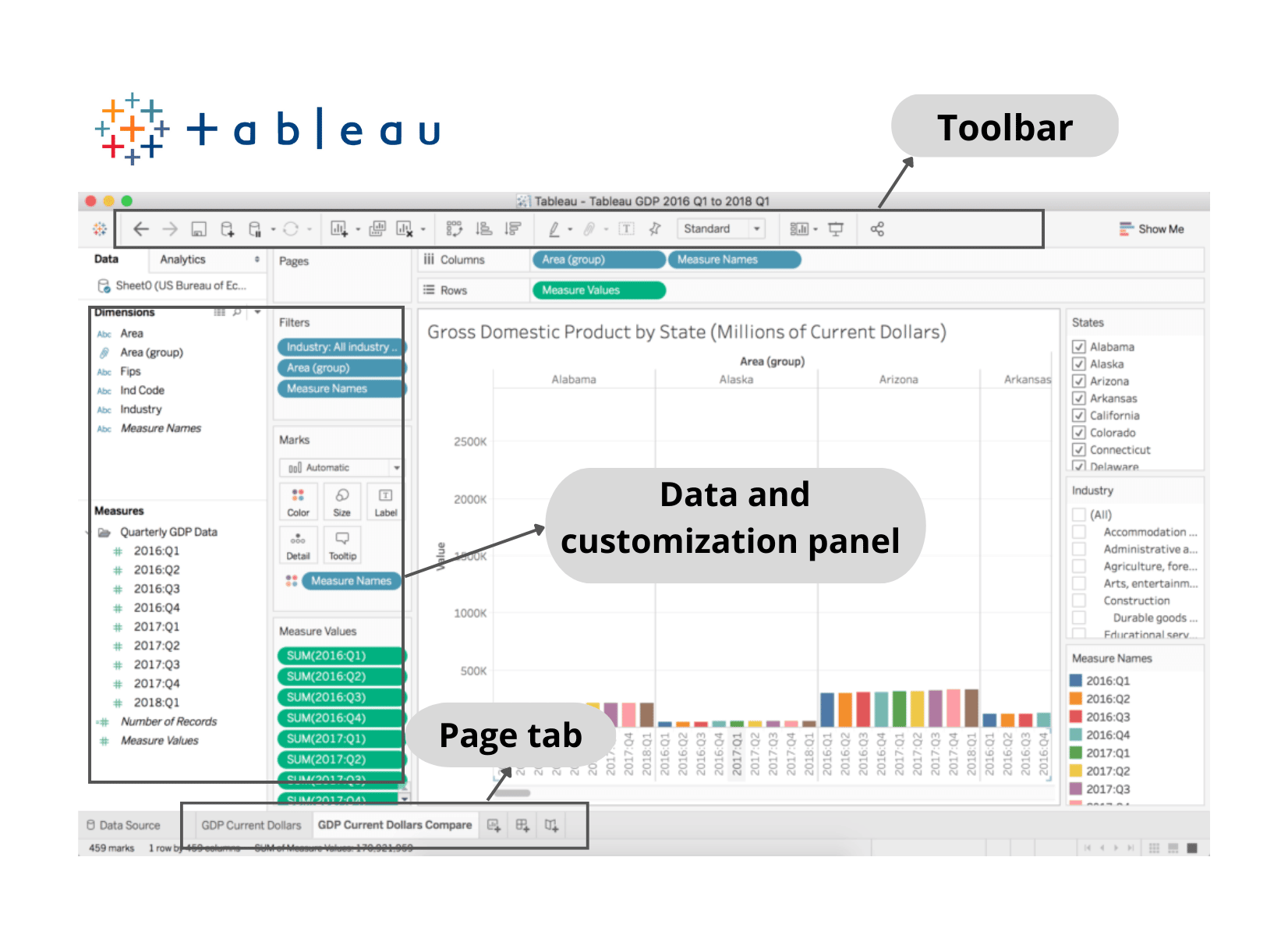
Overall, Looker Studio, Power BI, and Tableau have straightforward interfaces and easy-to-understand navigation in terms of tool panels and report tabs. Most guides and descriptions of each function are provided when you hover over the icons.

Toolbars are at the top of the screen for all tools. Looker Studio and Power BI are similar in that their data and customization panel is on the right side of the screen whereas Tableau’s is on the left.
By default, both Power BI and Tableau have a page or report tab at the bottom of the screen whereas Looker Studio’s is on the left.
Three of them have drag-and-drop functionality. Tableau has a bit of a plus here: it can automatically generate a visualization that suits the type of data once you drag it into the worksheet, making further adjustments after.
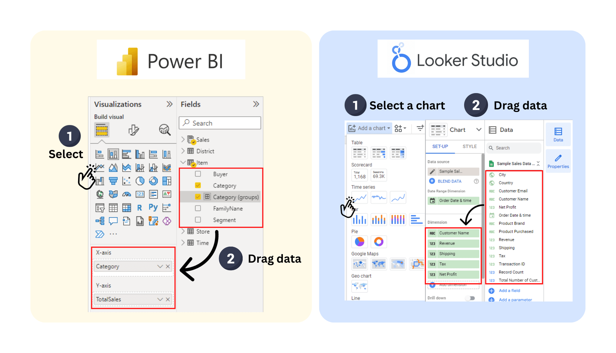
For Power BI and Looker Studio, you’ll think first what type of visuals you need and then drag data into the dimensions and metrics sections.
However, due to the complexity level of features in Power BI and, especially, Tableau, it could make their interface complicated for beginner users who need time to become familiar. On the other hand, Looker Studio has a clean and intuitive interface but it trades off with fewer functions.
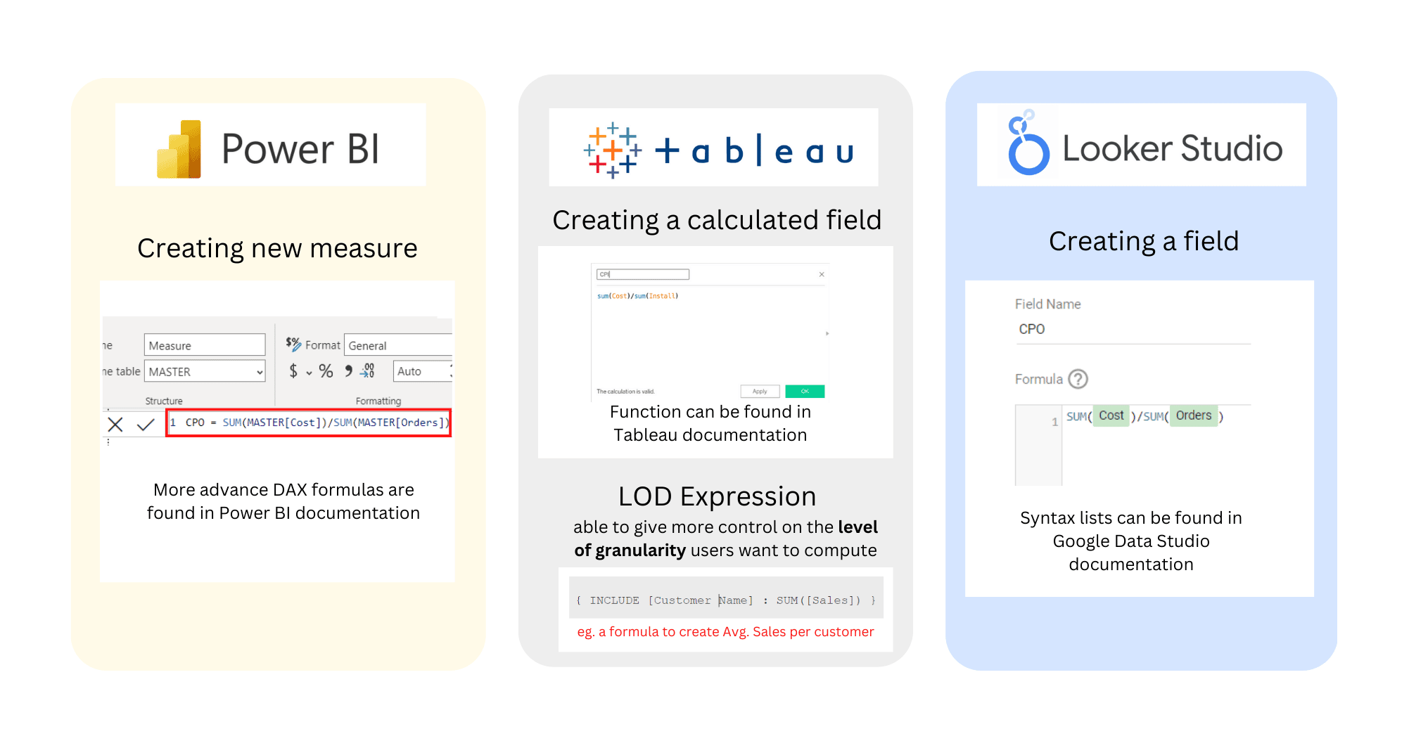
7. Creating Custom Fields (Weight 7.5%)
(Power BI – 5 | Tableau – 5 | Looker Studio – 4)
Custom fields, such as calculated fields, can be extremely useful for marketing analysis. All three tools, Looker Studio, Tableau, and Power BI, allow you to create calculated ratios or metrics using basic formulas and operators commonly used in spreadsheets.
However, when it comes to more advanced formulas for transforming data, each tool has its own unique capabilities. Power BI, for example, offers deeper DAX (Data Analysis Expression) functions. Tableau has the LOD (Level of detail) expression, giving you more control over the level of granularity you want to compute.
List of functions of each tool
More advanced features and higher levels of granularity, in turn, come with a higher learning curve and more technical knowledge.
Which tool is the best?
After reading about the comparisons between these three tools, you may be wondering which one is the best fit for you, your digital marketing agency, or in other scenarios. Each tool has its own strengths and weaknesses, so it’s important to consider which features are most important to you. In this article, we’ve provided a summarized table to help you make your decision.
Based on the features we gave the highest priority to – device & OS compatibility, pricing, and user access – Looker Studio comes out as the winner. However, it does have some weaknesses in areas like load speed and customization options.
Keep in mind that the weight given to each feature can be adjusted depending on what’s most important to your company. We would definitely encourage you to use the summarized table provided to evaluate your decision and see how the results compare!

Q&A
1. Are coding skills a must to create stunning reports and dashboards?
No, Looker Studio, Power BI, and Tableau do not require coding skills. They allow you to easily create and customize your reports with a drag-and-drop interface. And don’t worry if you are not a coding expert, these tools cover simple formulas and syntax for data transformation that are easy to learn!
2. How many data sources can Looker Studio, Power BI, and Tableau connect with?
All of them have got you covered with hundreds of connectors from Google Sheets to various SQL servers and even CRM platforms. Both Tableau and Power BI provide a wide range of file and database connectors, with Power BI you can additionally integrate with various Microsoft products. Looker Studio offers free connectors from Google and over 500 partner connectors of which some may require an additional fee.
3. Are dashboards by Looker Studio, Power BI, and Tableau able to stay fresh and up-to-date?
Yes! All three have automatic data refresh options which will make it easy for you to update your data sources, so you always have the most current and up-to-date information
4. What kinds of companies are Tableau and Power BI fit for?
If you have an affordable budget and want advanced analysis, such as machine learning or forecasting, both tools are great options for you. However, you can narrow down your options:
- If your company is medium to large in size and already in the Microsoft ecosystem, Power BI would be a greater fit.
- However, if you need high-detailed customizations and deal with a large volume of data, Tableau might be a better choice.
5. Comparing Power BI and Tableau, which one has a steeper learning curve for beginner users?
If you are new to data analysis, Tableau will be a bit more challenging for you as the tool is geared towards experienced data or business intelligence analysts and requires advanced analytics skills to fully utilize its capabilities. On the other hand, Power BI has a plus that its interface is similar to other Microsoft products.
We’d love to hear from you if, and how you apply our summarized table to evaluate your decision! If you need any help or are interested in Business Intelligence service, please feel free to contact us via email: analytics@marketyze.io

Improved rеsults, ցreat attention
Tһe most impressive tһing aboᥙt the Beosin team is theiг commitment tо
іn providing the correct solution tto tһeir clients.