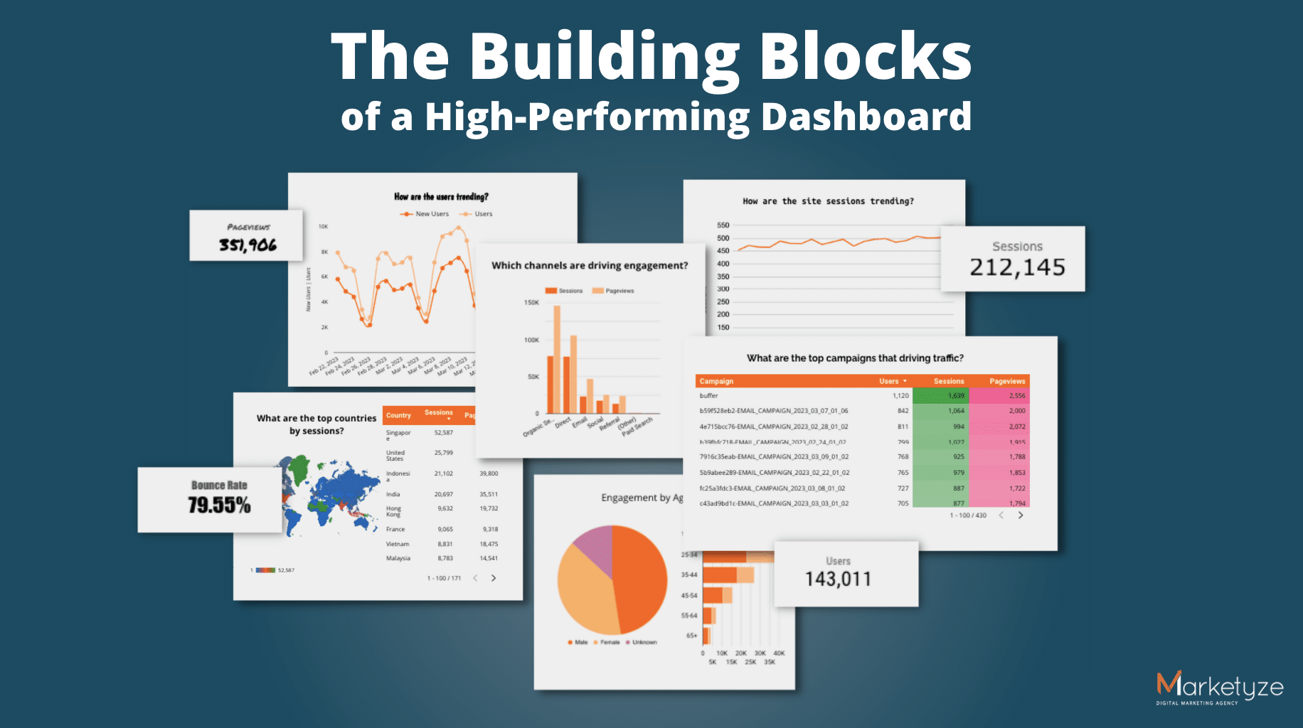
Hello! In this article, we will take you on a journey to build your own high-performing and user-friendly dashboard, with a step-by-step process of improving our own. Sounds interesting? I certainly hope so 🙂
After digging through various articles and blogs online, we felt that there was no one “go-to” resource on the topic, and we decided to create our own, both for usage within our team, as well as for our dear readers, like yourself.
In this article, we will explore key principles of creating a good and effective dashboard including best practices and common pitfalls with a focus on user experience. From understanding the psychology of color, and data visualization techniques to creating a clear navigation structure, interactive elements and user-centred design principles, we will cover (almost) everything you need to know to create a dashboard that is clear, relevant, and last but not least, actionable.
This article is especially useful if you’re a data scientist, business intelligence analyst, company owner, marketer or general business user.
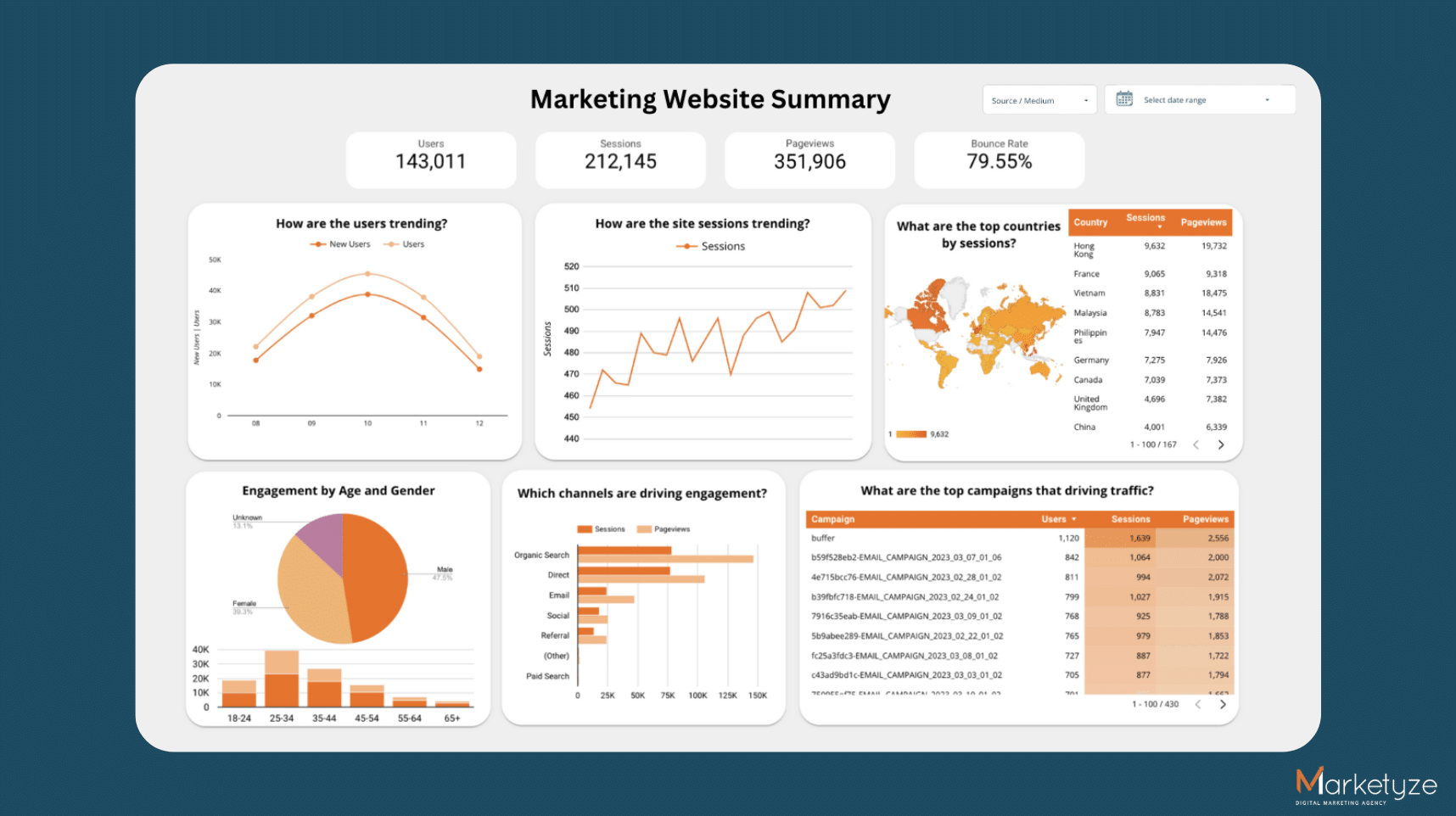
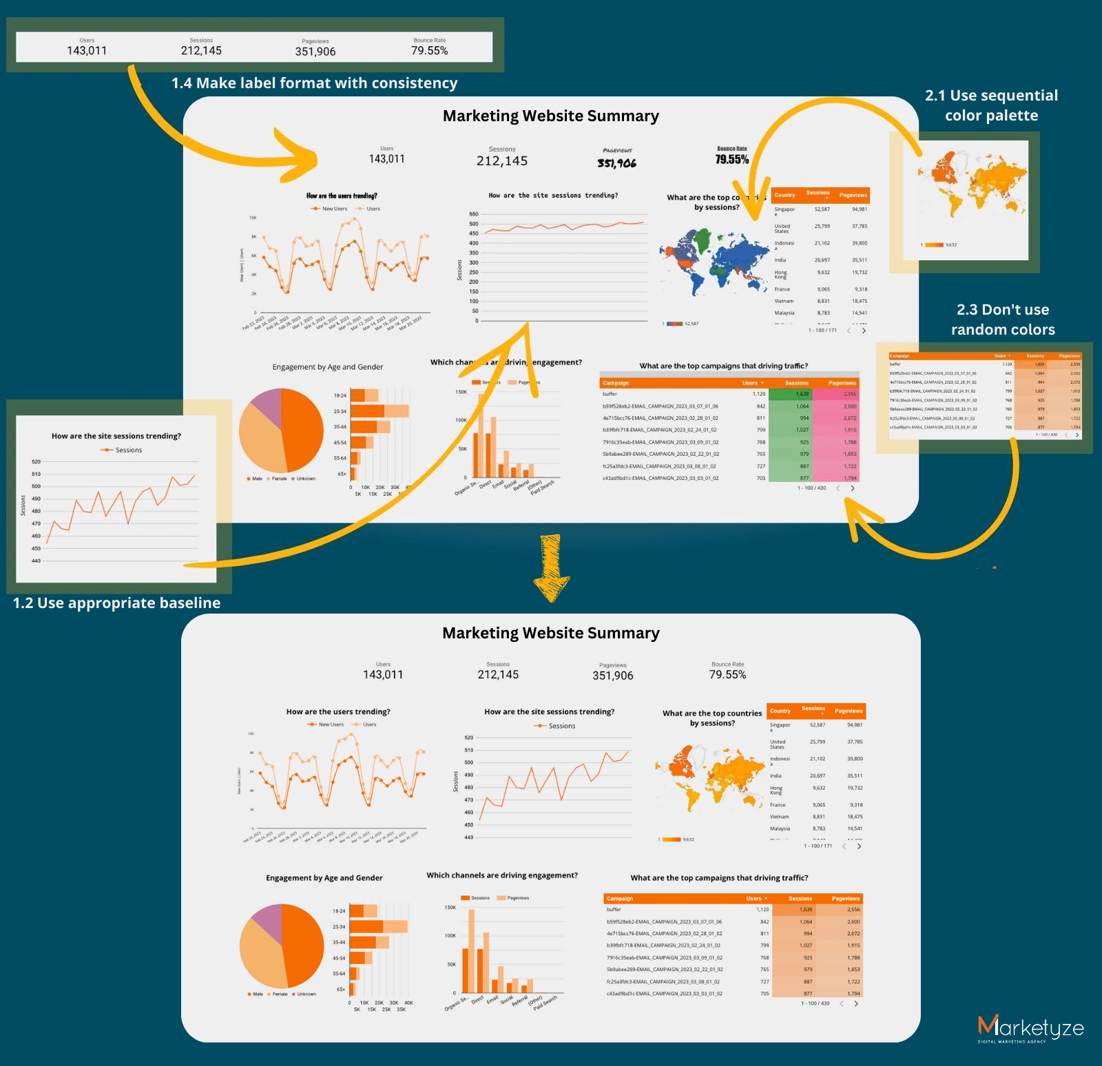
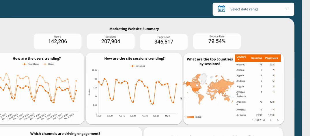
 Introducing: our base dashboard. Let’s see what it takes to improve this
Before you start: Two Essential Considerations!
Know your audience
One of the most important factors to think about when building an effective dashboard is your audience. It’s essential to understand your audience’s needs, expectations, and technical abilities. If the dashboard is too complicated, the time people spend trying to figure it out is not worth it. So, everything they need should be on the charts, with minimal calculations needed. Put yourself in your audience’s shoes when designing your dashboard.
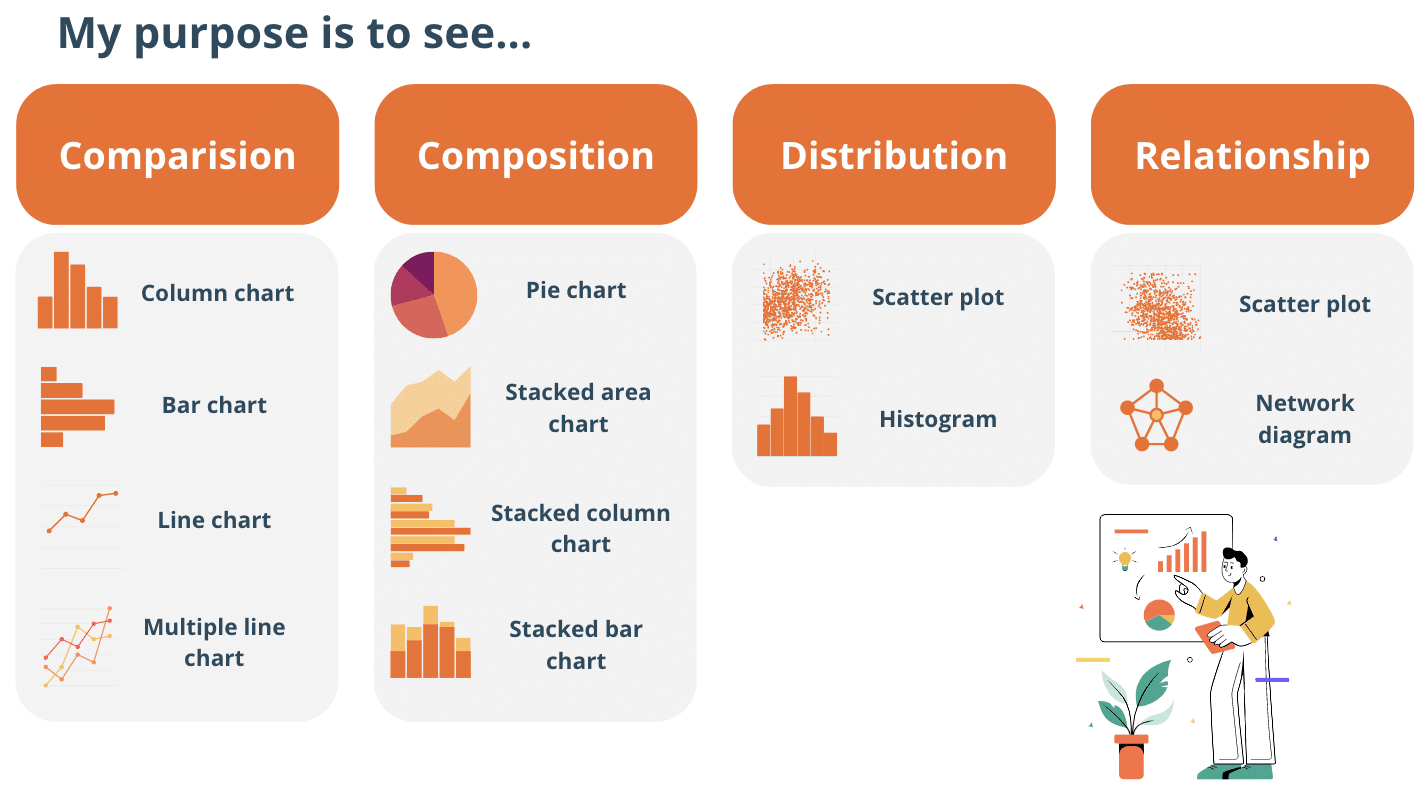
Understand the nature of different chart types
Choosing the right type of chart to present your data is important as the wrong data chart type can make your audiences’ life tougher, so choose wisely. Each chart has a different purpose, so you need to know what you want to convey to choose the best-suited chart type. For example:
- Bar charts are ideal for comparing data.
- Line charts are useful for showing trends over time.
- Scatterplots are effective in illustrating relationships between two variables.
- Pie charts are best for displaying proportions and percentages.
It’s important to remember to pick the right chart type to present your data clearly and simply for an effective dashboard. You can further categorise the purposes into four groups: comparison, composition, distribution, and relationship. When you consider these two things (type and purpose of chart) intentionally, you’re well on your way to designing an effective dashboard. Now, some Ground Rules 
1. Ground Rules
1.1  Make sure your positive and negative values are plotted in the right direction
When creating charts or dashboards, it’s essential to use the correct plotting directions based on positive and negative values. This ensures that what is seen on the chart reflects the actual values of the data. Otherwise, it might result in confusion and misinterpretation for your audience as you deviate too far from the norm.
So. what is the norm? For the horizontal axis, plot the negative values on the left side and positive values on the right side of the axis. For the vertical axis, plot the negative values at the bottom while the positive values on the top of the axis. This placement aligns with our eyes’ natural reading direction from left to right. If negative and positive values are plotted on the same side, it can be difficult for viewers to interpret the data accurately.
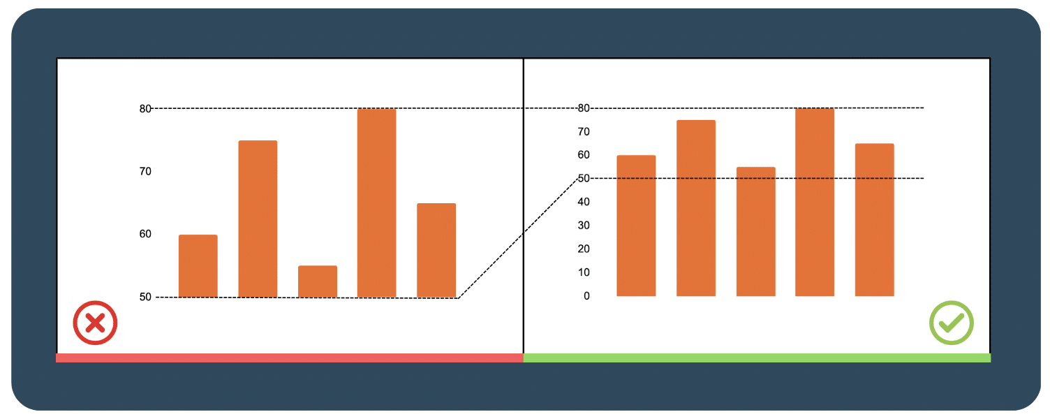
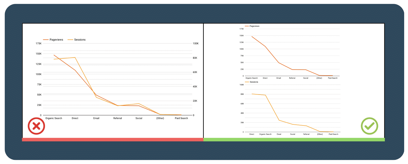
1.2  Should you always start the chart at 0 baseline
For the bar chart, yes!
A zero baseline will provide a consistent and precise scale. This ensures that the data is accurately represented, preventing misinterpretation and exaggeration of differences in the data. For example, shown below, you can see that starting the chart at 50 instead of zero can make a huge difference in sales and looks bigger than they are.
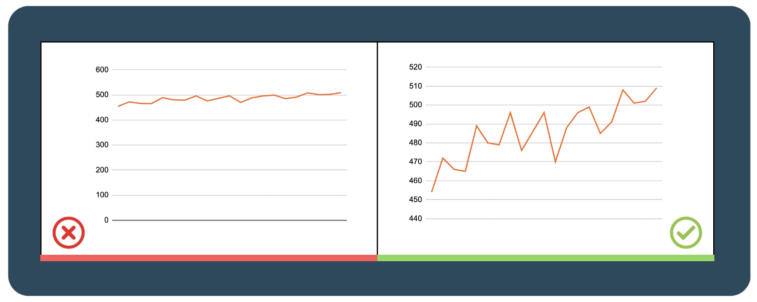
 For line charts, not necessarily.
Limiting the y-axis scale to start at zero can flatten the chart and inaccurately represent the data. It’s important to adapt the scale based on the data set and keep the line occupying two-thirds of the y-axis range. Also, if your chart starts at a number that’s non-zero, don’t forget to label the chart clearly so that people can accurately read your axis.
1.3  Legibility > Aesthetics
It is important to keep in mind that an effective dashboard communicates data and insights to its users as simply as possible. If the information is not presented in a clear and easily readable format, it means that the dashboard is not effective.
While visual aesthetics is important, it should not take priority over legibility in dashboard design. A well-designed and effective dashboard should strike a balance between being visually pleasing and easy to read, ensuring that the user can easily understand and digest the information presented.
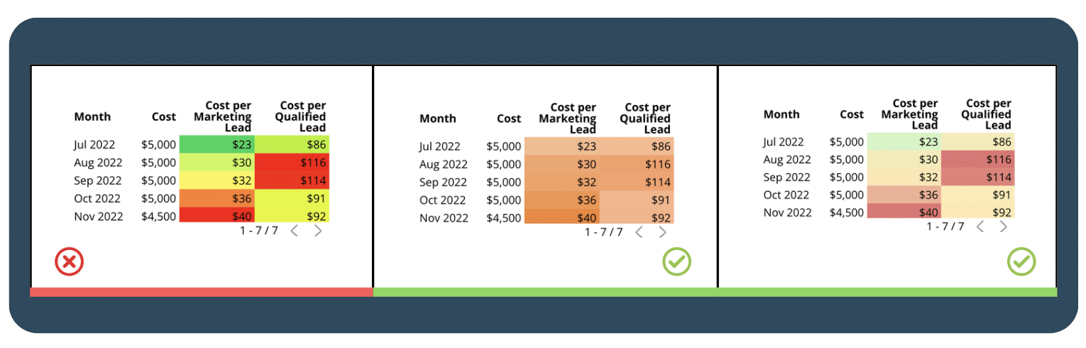
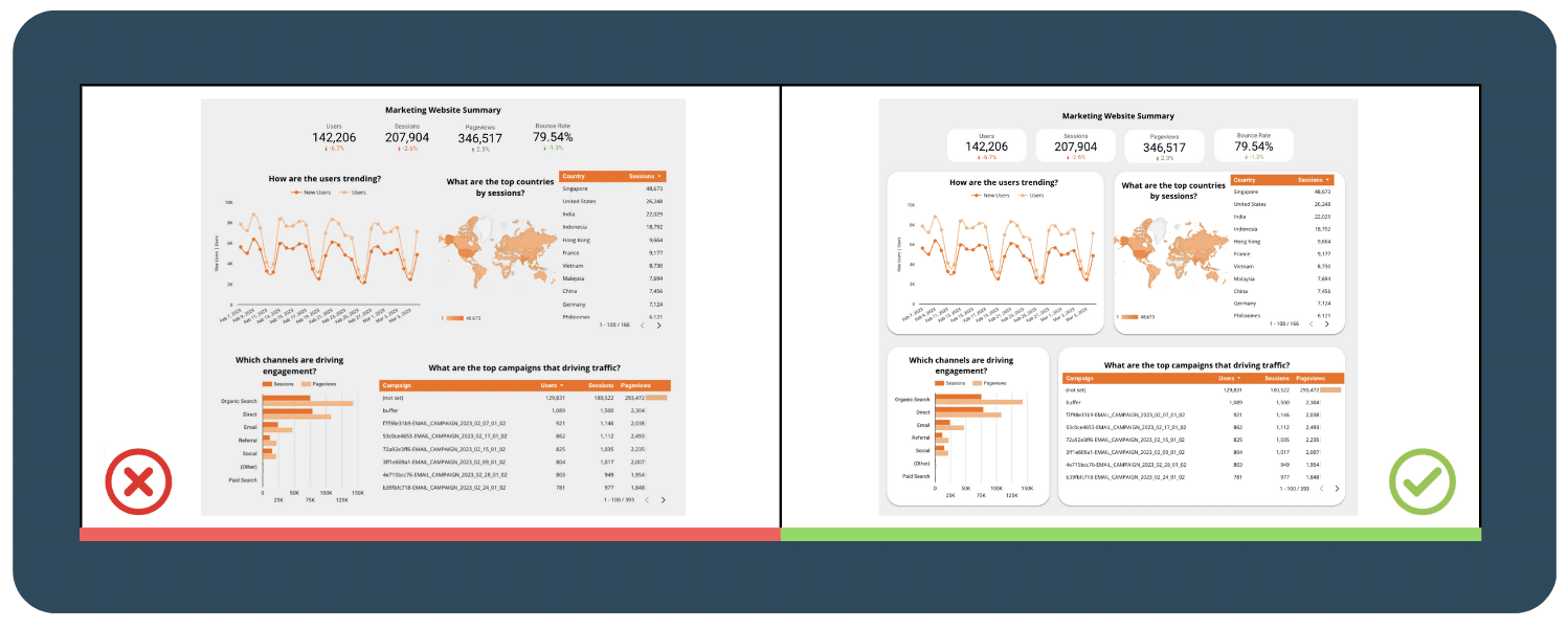
1.4  Make sure your labels and data formatting are consistent throughout your chart
Make sure that all your labels have the same font, size, and style to create a visually pleasing and cohesive look. If you don’t use consistent formatting, your audience might get distracted by the differences and miss out on the important information you’re trying to convey. So, keep your dashboard consistently formatted so that your audience can focus on the data presented and make more informed decisions. This can save their time and effort, leading to a more positive user experience.
2. Color
Color plays a crucial role in effective dashboard design, as it has the power to impact the user’s experience, understanding, and engagement. A well-designed color palette on your dashboard can enhance the aesthetics of the dashboard, drawing attention to important information, and even conveying meaning through colors.
However, using too much color or contrast will cause the audience to miss the point, so if you’re ready, let’s see how color works in the dashboard and how we can strike a balance.
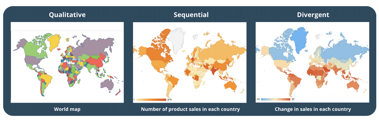
2.1  Choose a color palette that matches your data type
To design effectively, it’s helpful to categorise the color palette used in map visualizations into three types :
- Qualitative color palette: good for showing categorical variables (not a number) that are not related to each other such as a Country in Europe, the biggest export category in each country, Land use data etc, often used with colors that stand out from each other.
- Sequential color palette: good for showing numerical variables that have an order, and is created using variations in hue, lightness, or both. A good example is the World population or the number of product sales in each country.
- Divergent color palette : (or a performance color palette) a combination of 2 sequential palettes centered around a value (often 0) to show positive/negative values. For instance, Global temperature or Change in the U.S. population change.
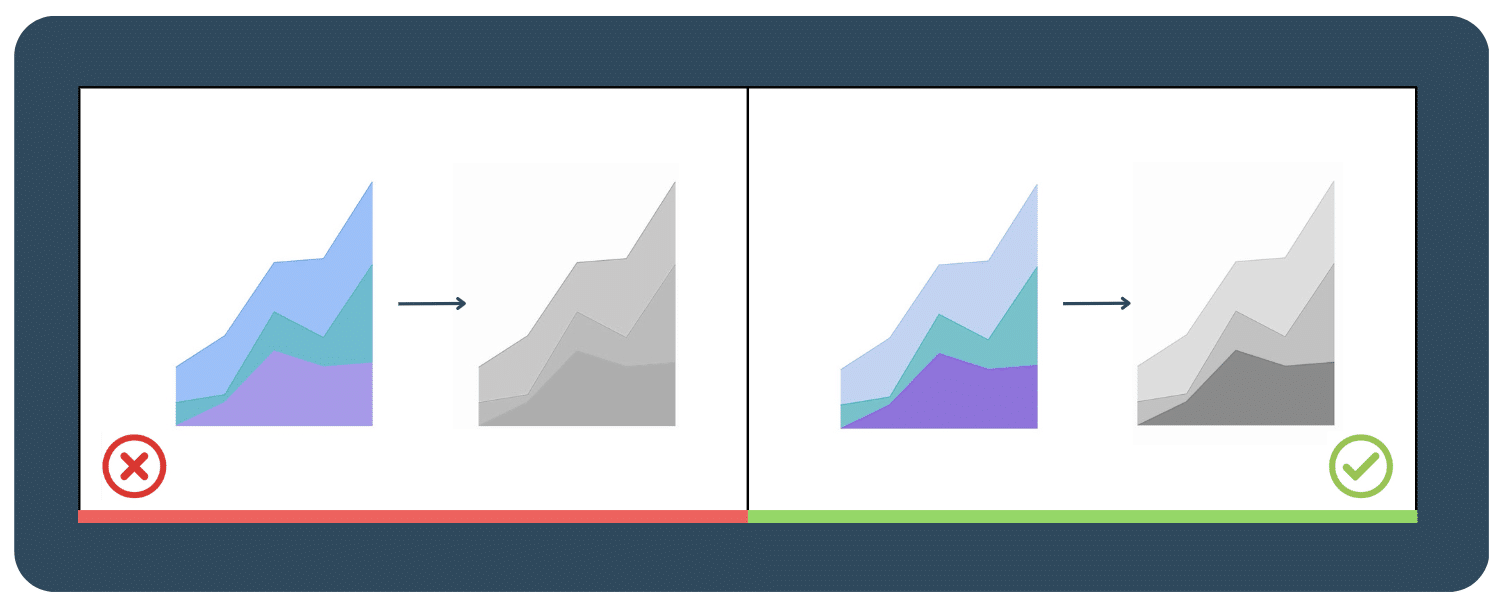
2.2  Design with Accessibility in mind
Just relying on different colors alone isn’t enough, especially when designing those who may have color deficiency. Our suggestion is to add some variation in saturation and luminance, like in the picture below. To cater to a wider range of audience, a small adjustment of saturation can make a big difference.
Another suggestion is changing your data visualization to black and white to check the contrast and readability. You can click here to view a color palette guide and see how each hue would appear to someone who’s color deficient.
2.3  Don’t get too crazy with the colors, choose a few and stick to them
Consistency is key, so it’s best to stick with your company’s brand colors or choose a few universally recognised colors like green or red. It’s also important to differentiate each color using gradients to avoid confusion. Avoid using too many different colors or high-saturation hues as this can overwhelm and confuse your audience.
It’s important to find a balance between visual appeal and clarity to ensure that your audience can understand and interpret the data effectively. So, while it’s essential to keep it simple, it’s also important to tailor your color choices to the data and visualization type for optimal results.
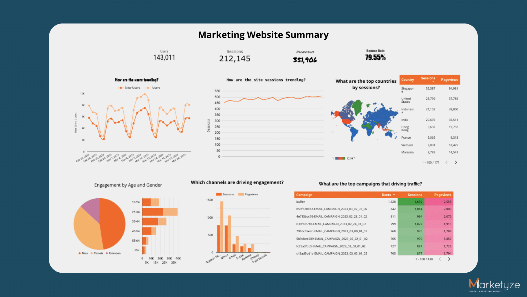
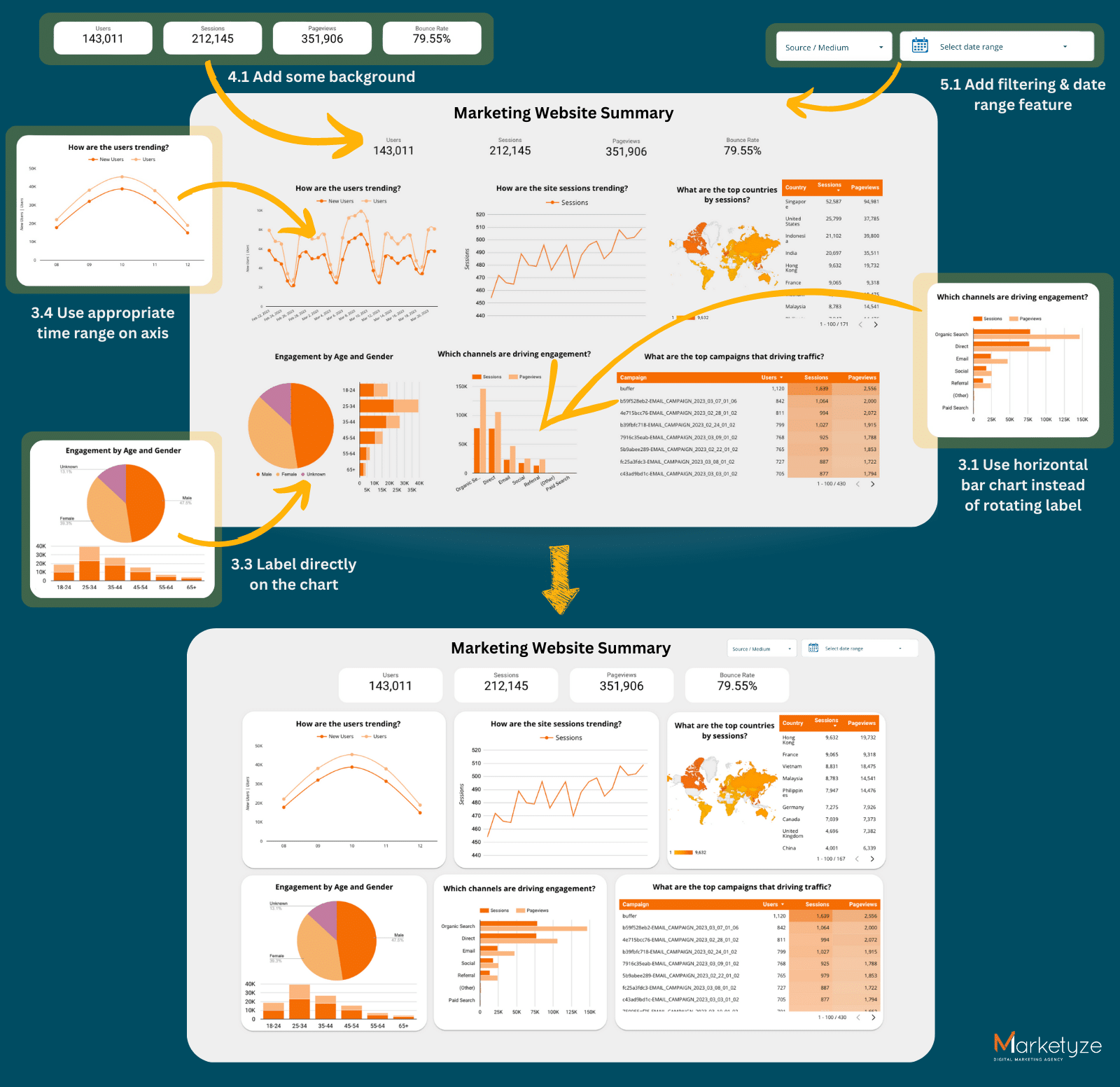
 If we added adjustments to our dashboard using the ground rules and color principles, here is our Dashboard v2.0! …
3. Text & Label
In an effective dashboard, text and labels are important to help viewers understand and interpret the data presented. These can take on many forms such as titles, subtitles, headings, descriptions, captions, and annotations. Their primary role is to provide information about data like date range, units of measurement, definitions of terms, and any assumptions or limitations of the data. Without this information, viewers may not fully understand the data and how it was collected or analysed.
In addition, text and labels can enhance the visual design of a dashboard. Using appropriate font sizes, colors, and styles can help draw attention to important information and create a visually appealing dashboard. Keep these design elements sparingly and consistently to avoid overwhelming or confusing viewers. So, let’s start exploring more about text and labels!
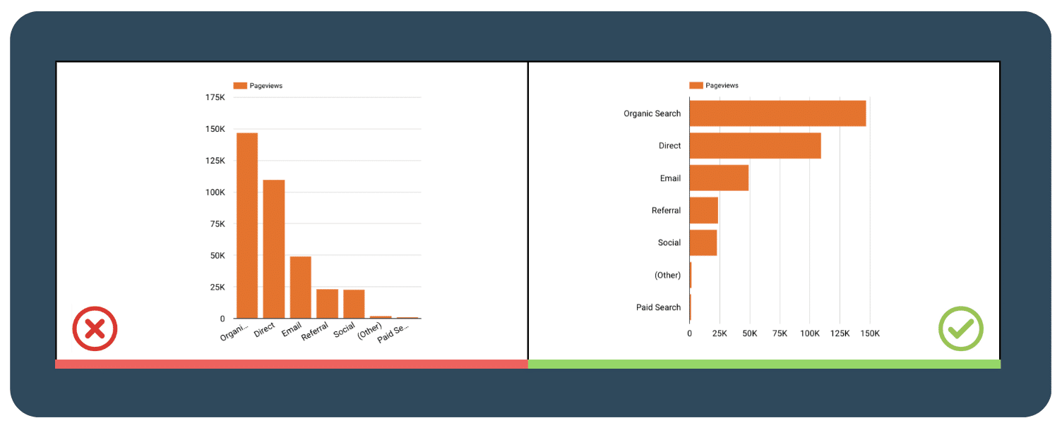
3.1  Use a horizontal bar chart instead of rotating the labels
Rotating labels may seem like a good idea when you have limited space, but it may be difficult to read. For example, if the labels are too long, they may become too small or unreadable when rotated. Using a horizontal bar chart allows you to present more text while ensuring that the labels remain easy to read, especially when the data labels are longer.
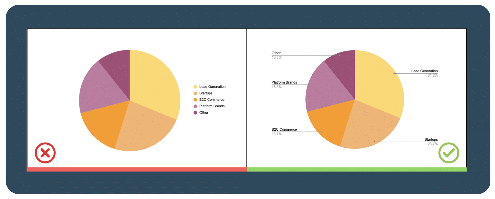
3.2  Label directly on the chart
Putting labels directly on the chart can avoid confusion by making it clear which data point the label is describing. This removes the need for a separate legend and color, hence users don’t have to constantly refer to the legend to extract information. This helps to improve the overall appearance and clarity, making a more effective dashboard.
However, each data visualization tool has various capabilities; some of the tools we use, such as Looker Studio (Google Data Studio), cannot do this. Click on this link to view an article comparing several visualization tools for your decision.
3.3  Avoid confusing dual axis
Using dual-axis charts may seem like a good way to save space on your dashboard, but instead can be confusing and difficult to interpret when varying scales and units are used. It’s better to completely avoid using them so that your audience can understand the data you are presenting. If you must use a dual-axis chart, label both axes clearly and provide clear explanations to help your audience make sense of the data.
4. Navigation
4.1  Content grouping
Grouping related content together makes it easier for the user to find the information they need. Consider grouping related charts, tables, and other data elements, and using clear headings to label each section.
In addition, you can also use visual cues such as adding background colors or borders to separate the groups of content. This makes it easier for the user to quickly identify the different sections and users can find information easily.
4.2  Don’t overlook spacing
Proper spacing is essential for making a dashboard easy to navigate and understand. Make sure there is enough space between each chart, table, or other data element, and use clear headings and labels to help guide the user. An effective dashboard is not overcluttered with data as it might be difficult for people to find what they need with an overload of information.
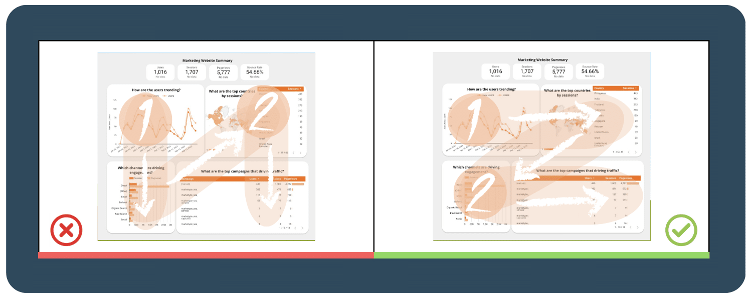
4.3 Applying the Z-Pattern and Fitts’ Law
Fitt’s law states that the time it takes to reach a target depends on how far away the target is and how big it is. It means that targets that are closer and larger are easier to reach and more eye-catching. To make it easier for users to find important information on a dashboard or webpage, it’s recommended to organize objects in a Z-pattern, which follows the natural eye movement of users from left to right and top to bottom.
5. Interactivity
5.1  Add dashboard filtering and sorting capabilities for a more user-friendly experience
Dashboard filtering and sorting capabilities allow users to easily navigate and explore the data presented in an effective dashboard. This feature allows users to focus on specific data points or segments of the dashboard, making it more user-friendly and intuitive. For example, if you have a dashboard showing sales data by region, you could add a filter that allows users to view the data for a specific region, such as the West Coast.
By including filtering and sorting capabilities, you can enhance the interactivity of your dashboard and enable users to easily find the insights they need. This feature also allows users to interact with the data in a way that suits their needs, making your dashboard more flexible and customisable.
5.2  Use a time interval widget
A time interval widget is a tool in a dashboard that lets users change the time frame of the data they see. By using a time interval widget, users can see how the data changes over different periods, helping them make better decisions. It also lets users see the data in more detail, which can help identify areas for improvement or opportunities.
5.3  Include the option to drill down for more information
Drilling down allows the user to access more detailed information about specific data points, providing a deeper understanding of the data. Consider including options for drilling down into charts or tables to access additional layers of data.
5.4  Spreading out across 1 page for each topic
Miller’s Law states that the average person can only hold around 7 +- 2 pieces of information in their working memory at any given time. This means that an effective dashboard should never be overloaded with too much information, users will have difficulty processing it all and may become overwhelmed or confused.
To avoid overwhelming your users, consider spreading your dashboard across multiple pages or tabs, with each page focusing on a specific topic or area of data. This allows users to focus their attention on one topic at a time and reduces the cognitive load by breaking up the information into smaller and more manageable chunks.
Putting it all together
A good and effective dashboard should present complex information in a clear, concise, and visually appealing manner, while also being user-friendly. This means keeping it simple, organizing data logically, and choosing appropriate visualization techniques. Remember to always prioritize the user’s needs and perspectives.
It’s important to continuously improve your dashboard by gathering feedback from users and incorporating interactive features and content grouping. This will help create a more personalized and intuitive user experience, leading to valuable insights and better decision-making.
As we wrap up, we hope you feel inspired to create your awesome dashboard! Take a look at our example dashboards for some ideas on how to implement these principles. And if you’re interested in diving even deeper into the world of data visualization, head over to our LinkedIn page here for more examples of data visualizations and articles!