If you are a marketer and have experience working with Lazada data, you might find it time-consuming for the process of manually pulling the data. Fortunately, there’s a more efficient solution! In this article, I will walk you through the process of automating the retrieval of Lazada ads data using the Lazada API.
Also, I share you with a non-coding template in spreadsheet format below which helps you get Lazada data easier. Let’s dive in and make your data analysis much easier and faster! 
Step 1: Prerequisites before you can start
Before diving into the code development process, there are a few essential things you need to complete to ensure a smooth process:
- Become a developer: Register your account and sign up as a Lazada Developer. This step is crucial to access the Lazada API and utilize its features.
- Create application: You’ll need to create an application within the Lazada Developer platform. There are various categories to choose from, each with its unique attributes like strategy types, authorization duration, API group permissions, and API call limits. You can read each of them in detail from the reference I provided above. For me, I created an app with the ‘ERP System’ category.
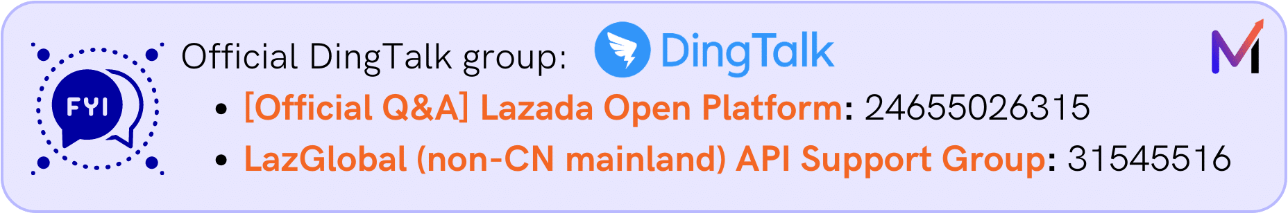
 Please note that both the “Become a Developer” and “Create Application” steps may take 2-3 business days for approval from the Lazada Team. In case of any delays, consider contacting the support team through DingTalk for further assistance.
If Lazada requires you to provide call call-back URL, it can be any. Call back URL will be used to retrieve the code parameter which I will use further in the next point
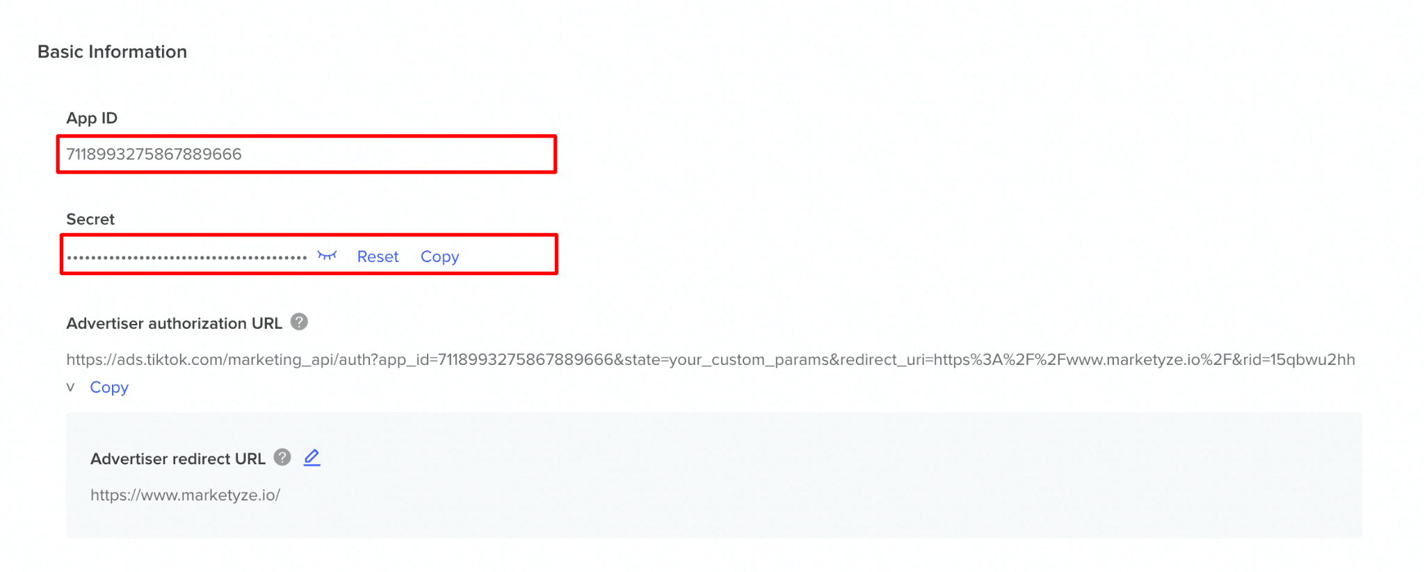
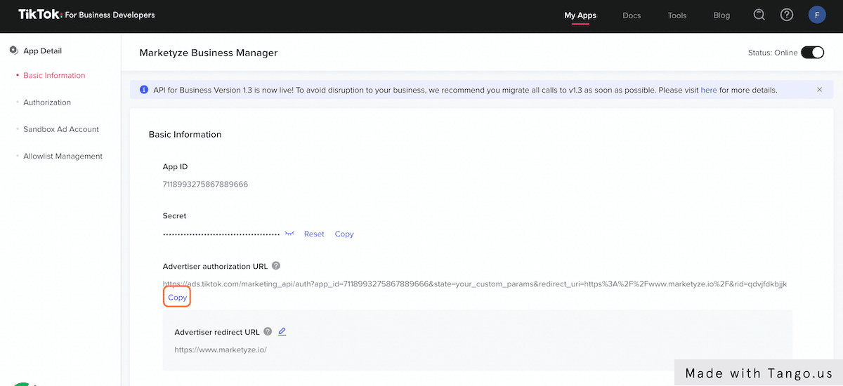
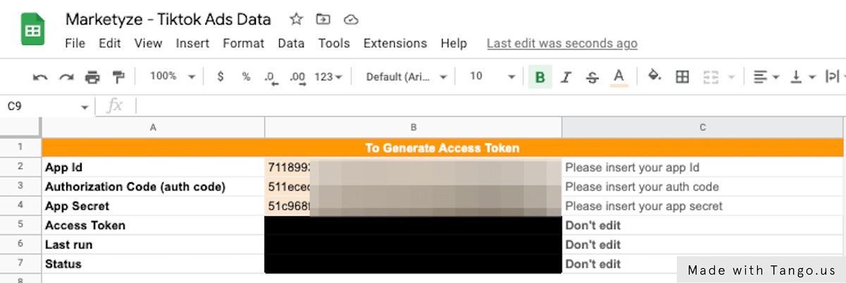
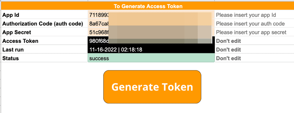
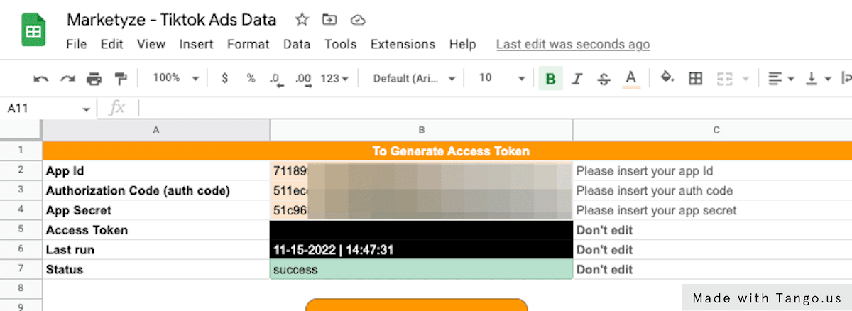
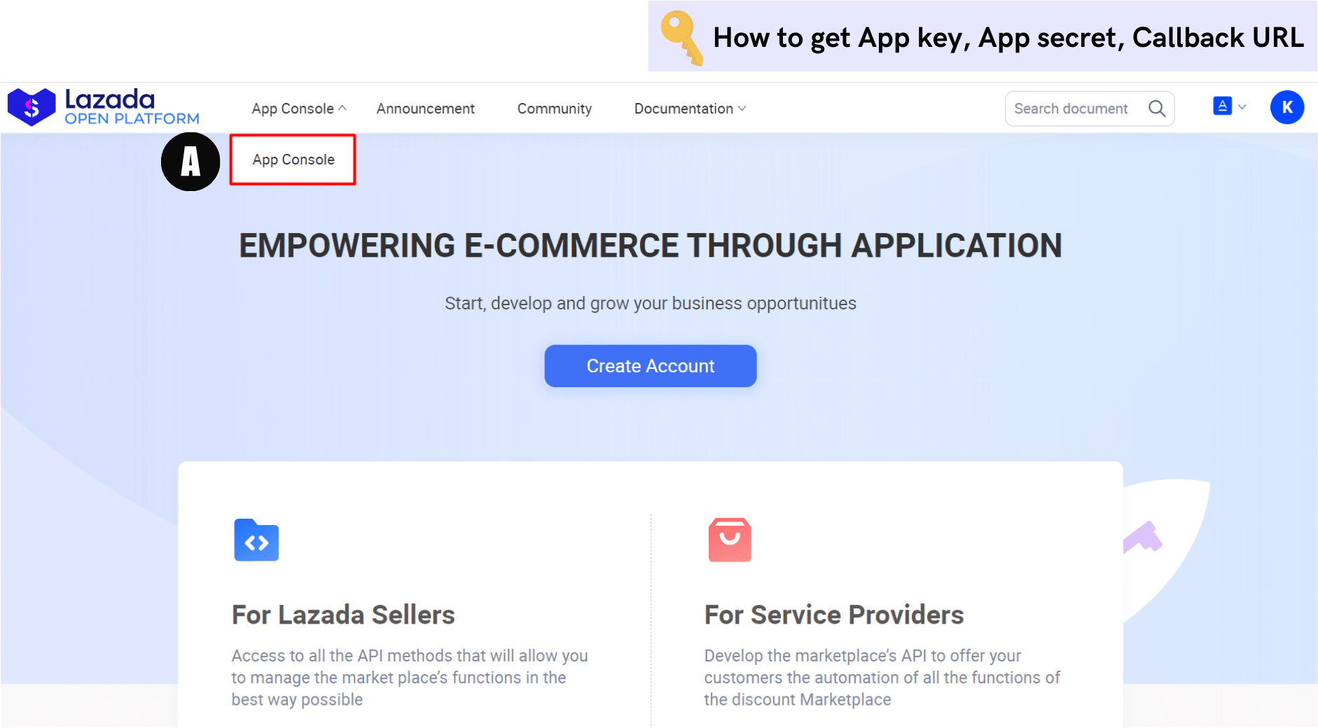
1.1 Get your App Key, App Secret, & Callback URL
- Once your application is approved, you will receive an app key, app secret, and callback URL, which will be used further for making API calls. To access this information, follow these steps:
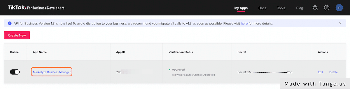
- (A) Go to the App console at the top of the menu panel. You’ll be redirected to Lazada Service Provider Center
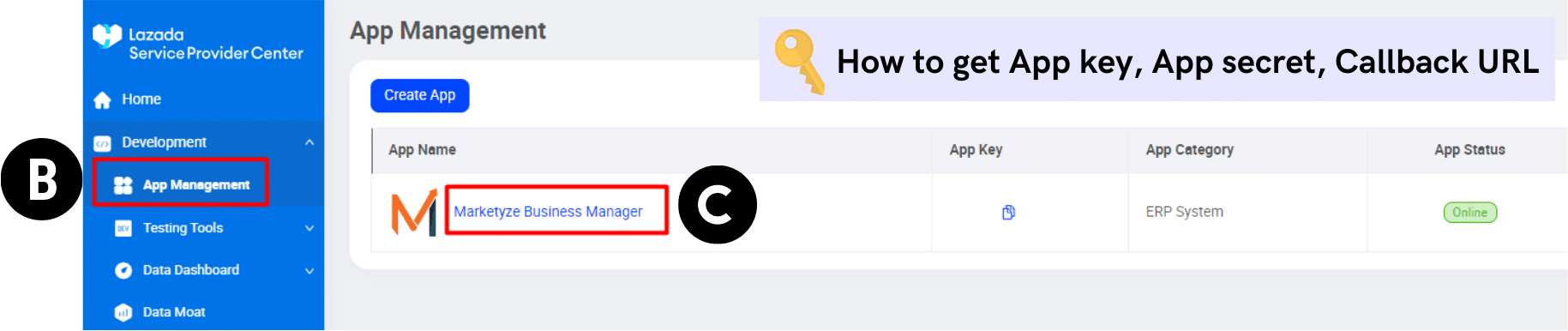
- (B) Navigate to the Development menu and choose App management
- (C) Click on your specific app
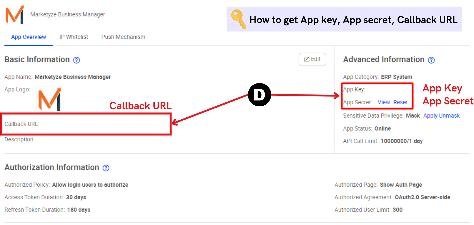
- (D) Under the ‘App Overview’ section, you’ll see your App key, App secret and Callback URL. Please keep them to later for obtaining
- Code parameter (which will be used for acquiring access token later in step 2): requires App key and Call back URL
- Access token and campaign data: requires App key and App secret
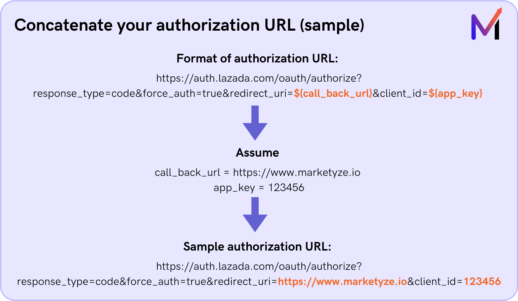
- Code parameter: This is one of the important parameters used for getting an access token later in Step 2. It can be retrieved from an authorization URL which requires your app’s callback URL, and app key as inputs. To structure the authorization URL, follow the format below provided by Lazada Open Platform.
Format of authorization URL from Lazada Open Platform (You can replicate the structure and replace it with your callback URL and App key with the highlighted part in orange) :
https://auth.lazada.com/oauth/authorize?response_type=code&force_auth=true&redirect_uri=${call_back_url}&client_id=${appkey}
1.2 Get your Callback URL Authorization code
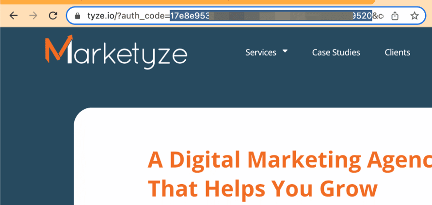
After obtaining your personalized authorization URL, open it via a web browser. Select the country where your store operates and provide the username and password from your Lazada Seller Center account. Click the submit button.
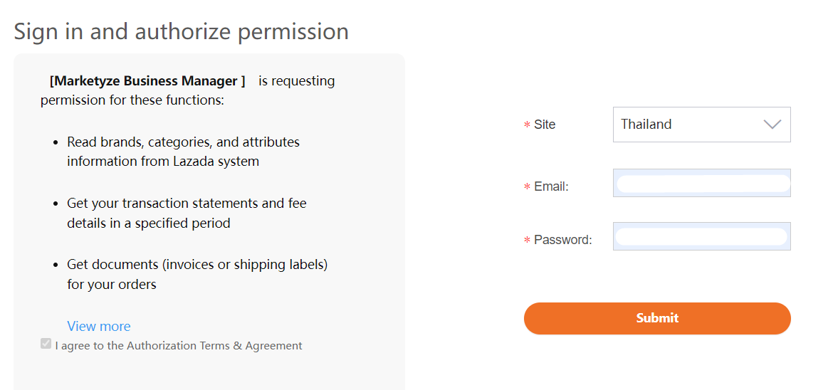
Upon clicking the sign-in button, you will be redirected to your callback URL, and the URL itself will contain your authorization code. (begin after the word ‘code=’ and end before the ‘&’ symbol)

Please note that the code you retrieved will be valid only once. 
If you run the script and get an error, you’ll need to repeat the steps above to get the code parameter again
By completing these prerequisites, you’ll be well-prepared to move on to the next steps of integrating the Lazada API and automating Lazada ads data with ease.
Step 2: Ready to Automate Lazada Data!
At this stage, you can choose either to go with (2.1) a non-code or (2.2) a code-based approach, based on your specific circumstances and preferences
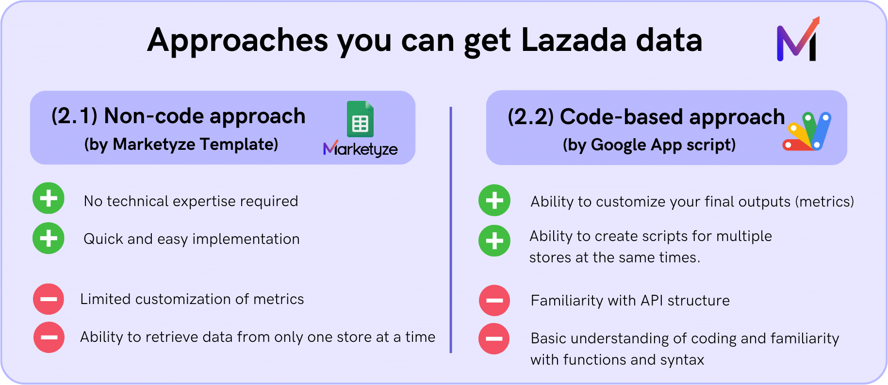
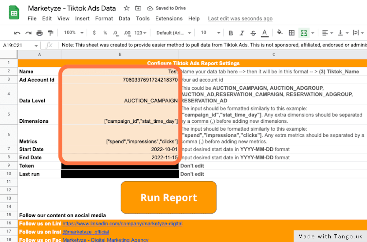
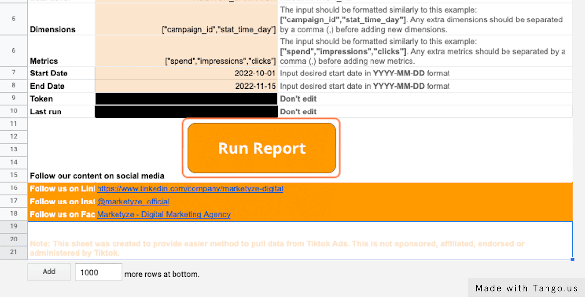
2.1 Non-code Approach – Utilizing a Free template
For the non-coding part, I’ve prepared a template that makes Lazada automation effortlessly accessible to you – no coding required! Simply follow the step-by-step instructions I’ve provided below.
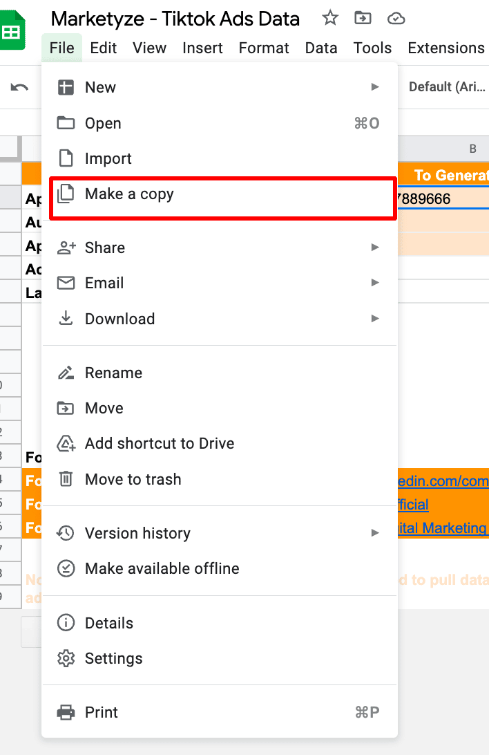
Please make a copy of the template sheet and you’re ready to go 
It’s recommended that you open the step-by-step guide while you’re using the template to avoid any confusion.
https://app.storylane.io/share/9arwxalzli3n
2.2 Code-based Approach – Understand Lazada API structure and begin Development
For those inclined to develop code yourself, we’ll be focusing on two crucial aspects: (1) generate an access token and use the token to (2) request data from the specified endpoint (in this case, obtaining campaign data).
I’ll demonstrate using Google App Script as the scripting tool. You’ll need to run two functions separately as shown in the visuals below and it’s recommended to separate them into 2 script sheets (one for access token and one for Lazada campaign data) to avoid your confusion
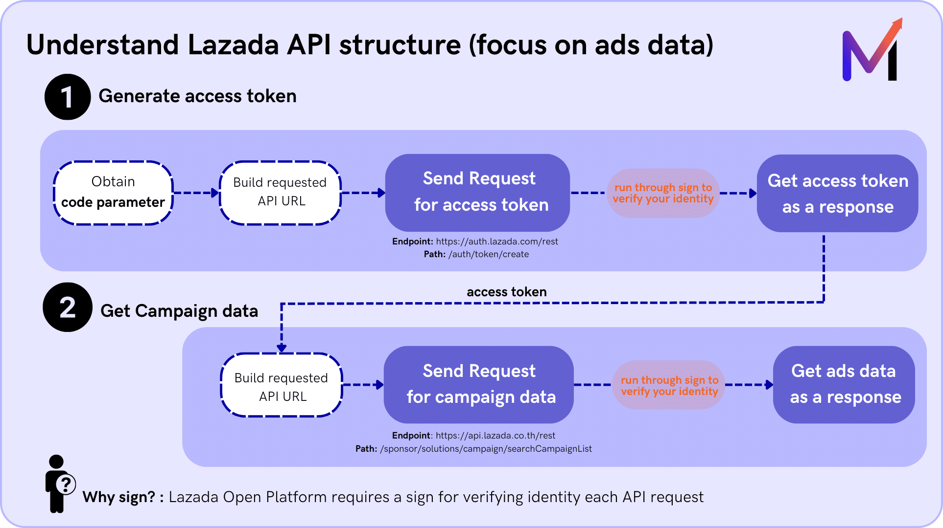
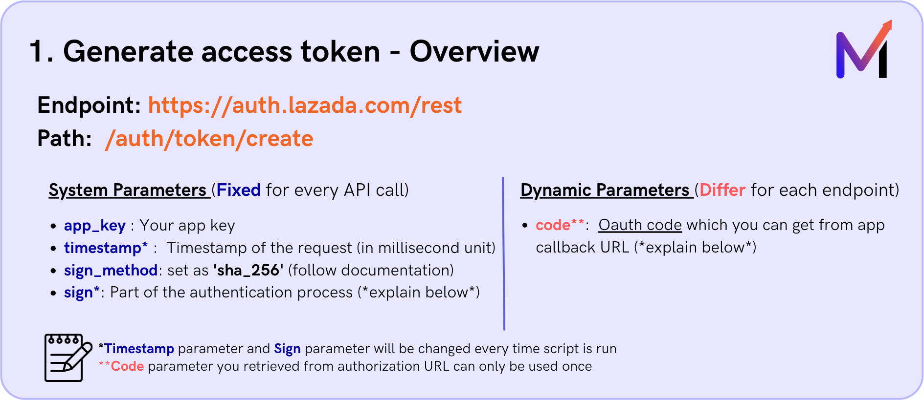
(1) Generate access token (for more information: click here)
For all regions, to acquire an access token, you’ll need to use this endpoint: https://auth.lazada.com/rest and path /auth/token/create for requesting Lazada API.
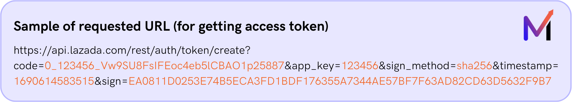
1.1 Build your requested API URL
To build your requested API URL, you’ll need to understand from the documentation what parameters are required.
You can simply read through the details of the structure for your understanding, I’ve also provided you with a code snippet below for each part!
For obtaining the access token from this endpoint, the mandatory parameters include: (1) app_key, (2) timestamp, (3) sign_method, (4) code, and (5) sign
1.2 Obtain the sign parameter.
With most of the parameters ready (app key, timestamp, sign method, and code), the next step is to obtain the sign parameter.
Lazada Open Platform requires a sign as a part of the authentication process for verifying the identity of each API request you make. To obtain this sign, you will need all system and dynamic parameters, page path and your app secret. (obtained from Step 1) Follow these steps to get the sign:
- Sort all request parameters
- Concatenate the sorted parameters and their values into a string
- Add the API name (page path) in front of the concatenated string
- Encode the concatenated string in UTF-8 format and make a digest by the signature algorithm (using HMAC_SHA256)
- Convert the digest to hexadecimal format with uppercase letters
You may use ChatGPT to assist in coming with code snippets for sign. I’ve provided one sample which you may use as a reference
ChatGPT prompt:
“Please write JavaScript code for Google app script to generate a signature. Within the same function, please put variable page path, app secret and parameters on the top of the function and follow by:
1. Sort all parameters using the keys object. (Name it as storeys)
2. Concatenate the sorted parameters with key and value. Please make sure key and value joint without having ‘=’ and ‘&’ (Name it as concatenated string)
3. Add page path in front of concatenate string. (Name it as a query)
4. Sign the resulting string using HMAC-SHA256 and make sure to convert the app secret and query to bytes
5. Convert the binary signature to a hexadecimal string and make it upper case. (Name it as signature)”
A code snippet is provided below for obtaining the sign using Google App Script. You may use it as a reference!
1.4 Get your store’s token
After encoding the URL and sending the request, you should receive the token for your store, which will be used for further requests to access the endpoint for campaign data retrieval.
Please keep in mind that the generated token has a validity of 30 days.
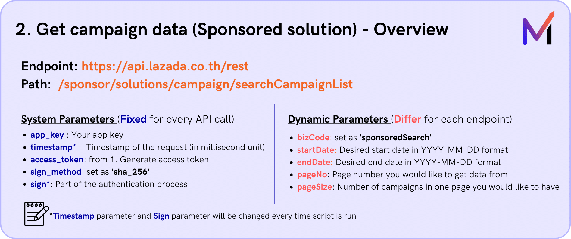
(2) Get campaign data (for more information: click here)
To fetch campaign data, you’ll need to use the endpoint that matches the location of your store. Currently, Lazada API supports for 6 countries.
- Thailand : https://api.lazada.co.th/rest
- Singapore : https://api.lazada.sg/rest
- Vietnam : https://api.lazada.vn/rest
- Philippines : https://api.lazada.com.ph/rest
- Malaysia : https://api.lazada.com.my/rest
- Indonesia : https://api.lazada.co.id/rest
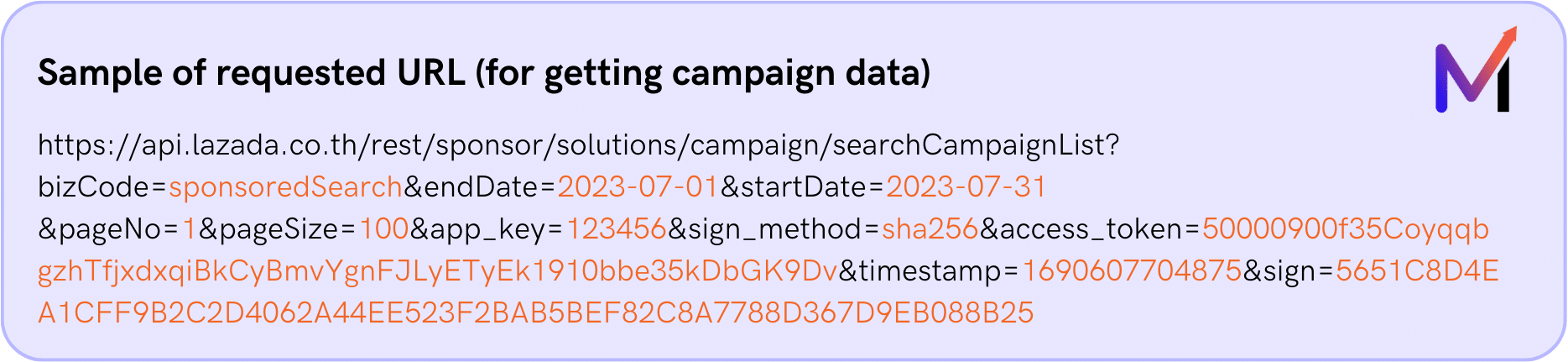
In this case, I will use the Thailand endpoint, which is https://api.lazada.co.th/rest , followed by the path that provides the necessary marketing metrics: /sponsor/solutions/campaign/searchCampaignList.
2.1 Construct your API URL
Similar to generating the token, you’ll construct your requested API URL.
For the path /searchCampaignList, required parameters include (1) app_key (2) timestamp (3) access_token (4) sign_method (5) sign (6) bizCode (7) startDate (8) endDate (9) pageNo (10) pageSize
2.2 Get a sign parameter
For this endpoint, there’s no requirement for a code parameter but you still need to acquire a sign parameter, just as you did when generating the access token. [Refer to (1) Generate access token]
A code snippet provided below is an example of how you can set up your script by having it run in a loop to get Lazada Ads at daily level. Feel free to use it as a reference!
However, don’t forget to make changes on some variables which are client_name / appSecret / start / end / app_key / access_token.
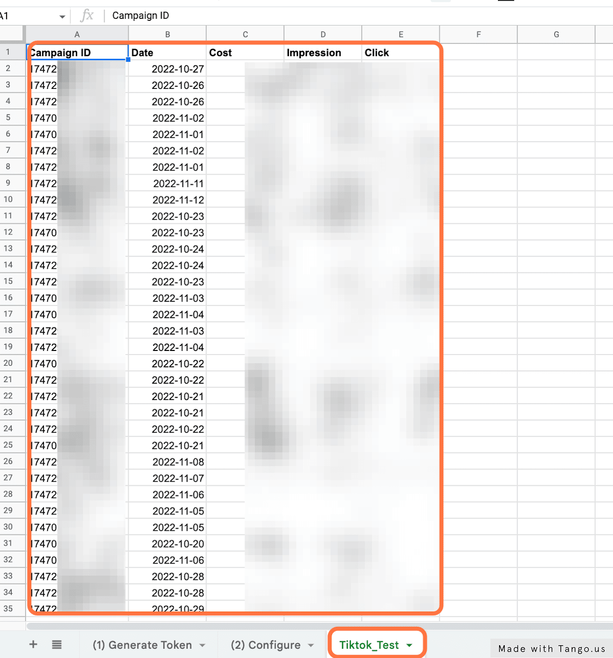
2.4 Successful Retrieval of Data
After encoding the URL and sending the request, you will successfully retrieve campaign data from the Sponsored Solutions!
I’ve provided you with a code snippet on how to append data to your sheet. For this case, the code will filter only campaign data with spending more than zero.
We hope you found the information we provided useful!  If you have any questions or need further assistance in understanding anything, don’t hesitate to reach out to us at analytics@marketyze.io or kung@marketyze.io Happy to help and discuss further on the topic!

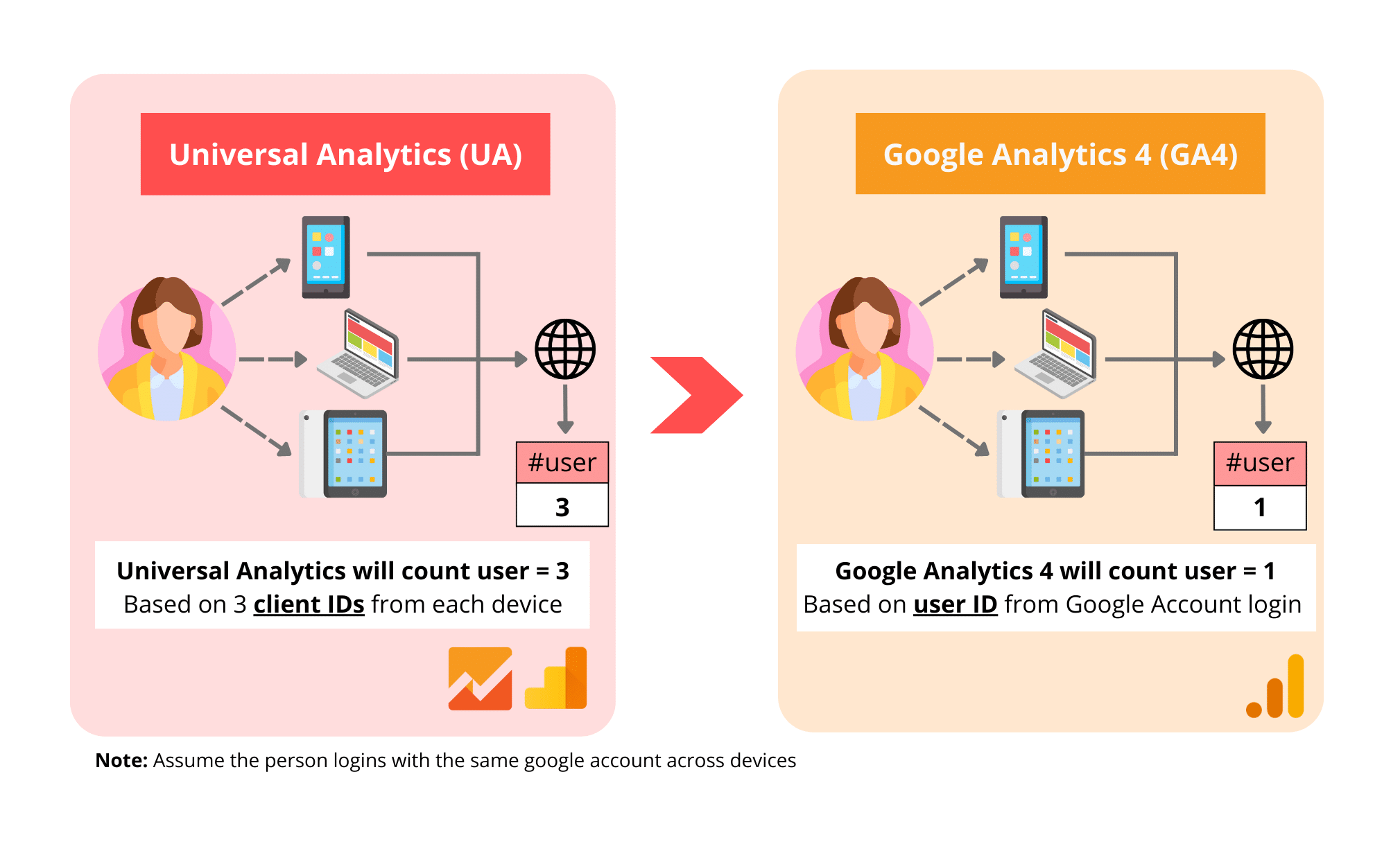
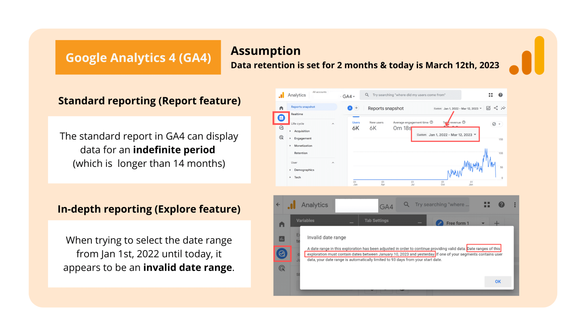
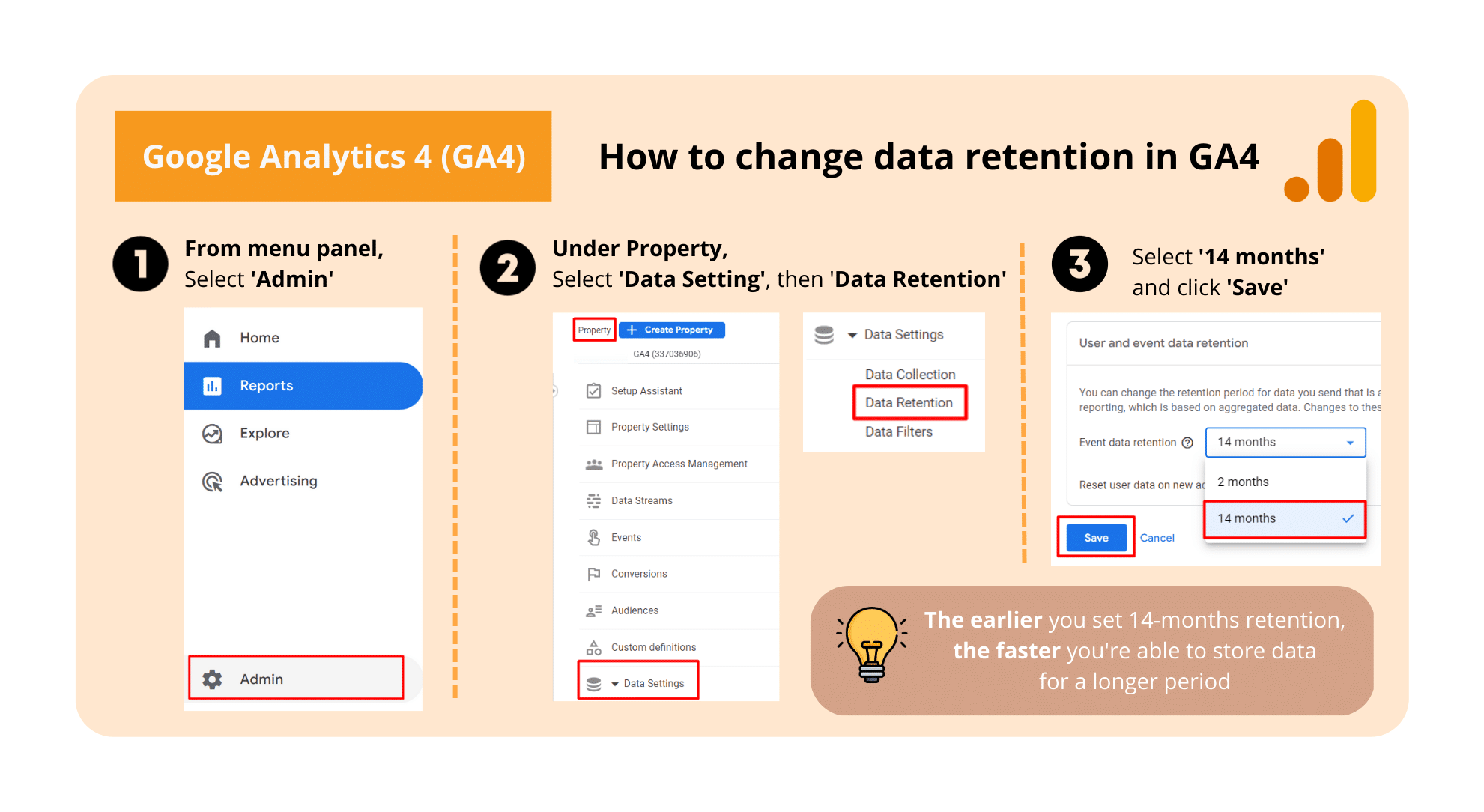
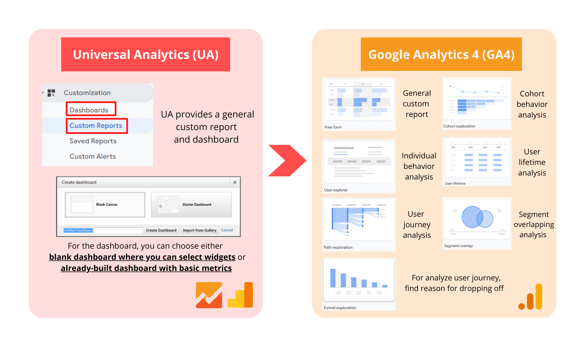
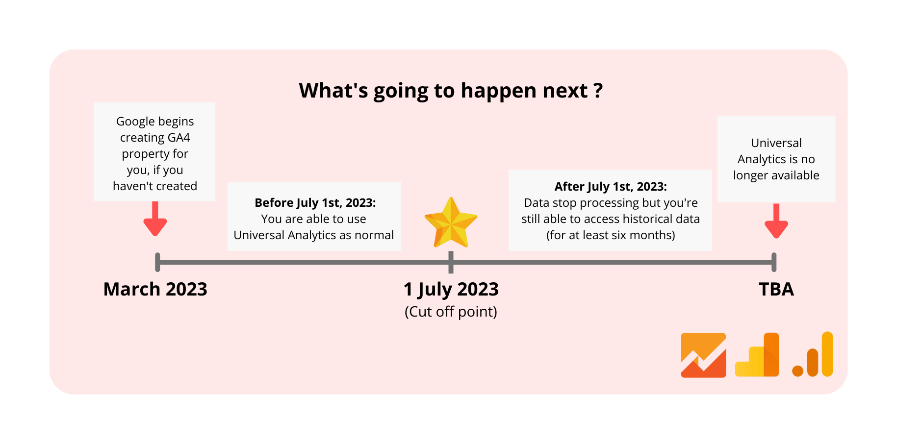
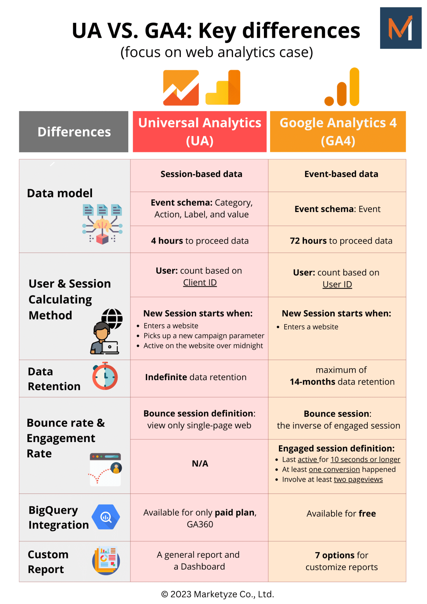
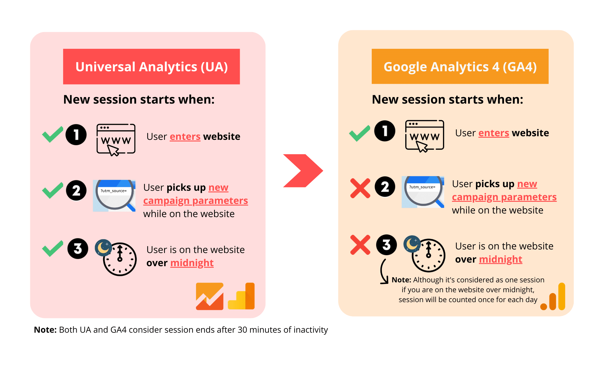 3. Data retention
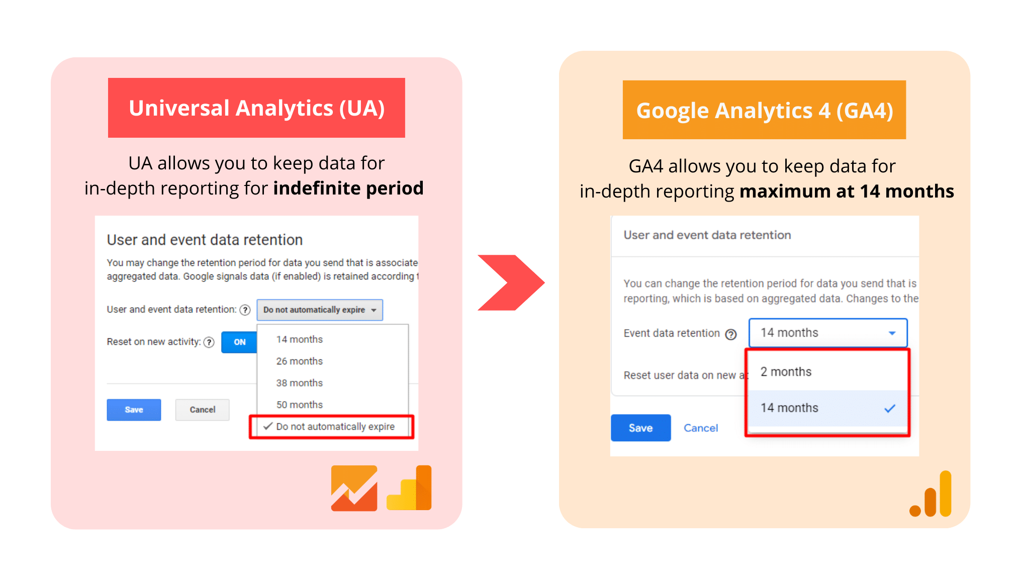


 Make sure your positive and negative values are plotted in the right direction
 Should you always start the chart at 0 baseline
 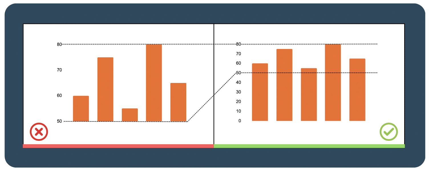 F
F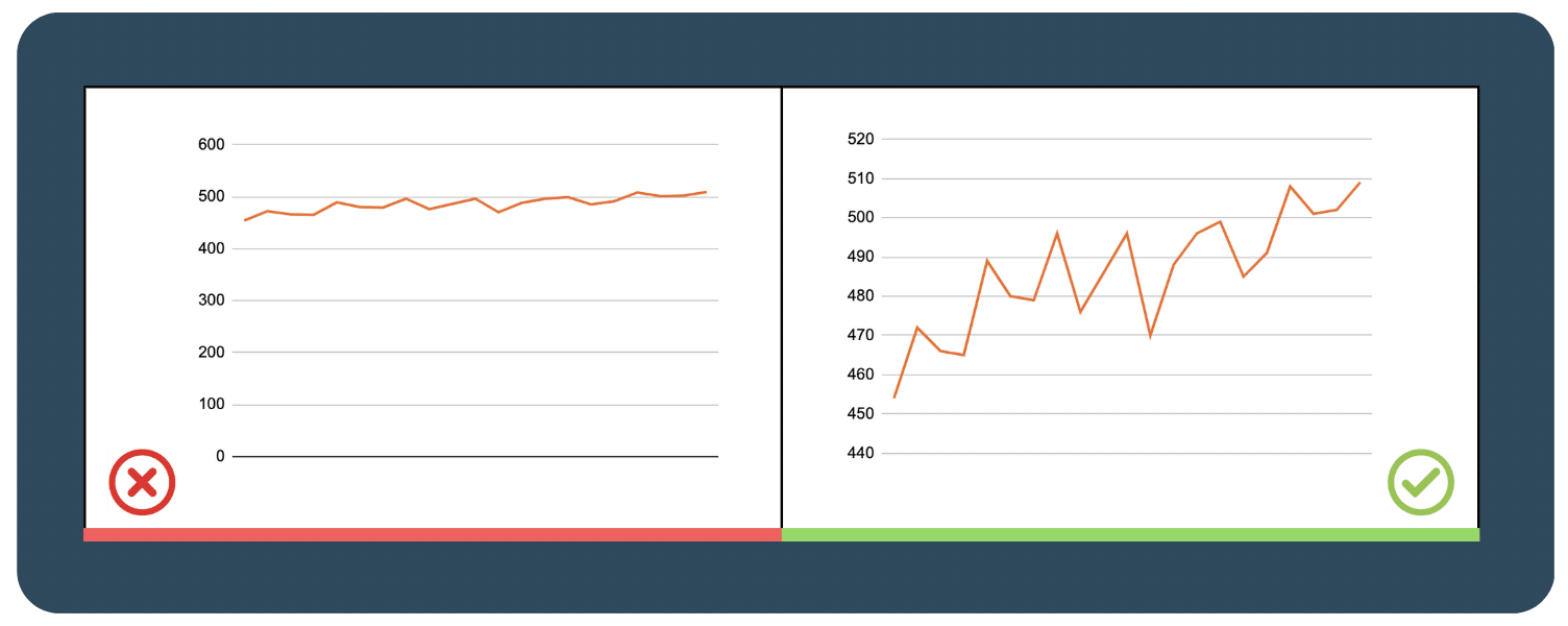
 Legibility > Aesthetics
  Make sure your labels and data formatting are consistent throughout your chart
  Choose a color palette that matches your data type
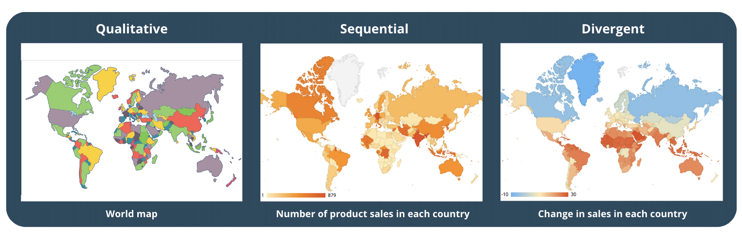
 Design with Accessibility in mind
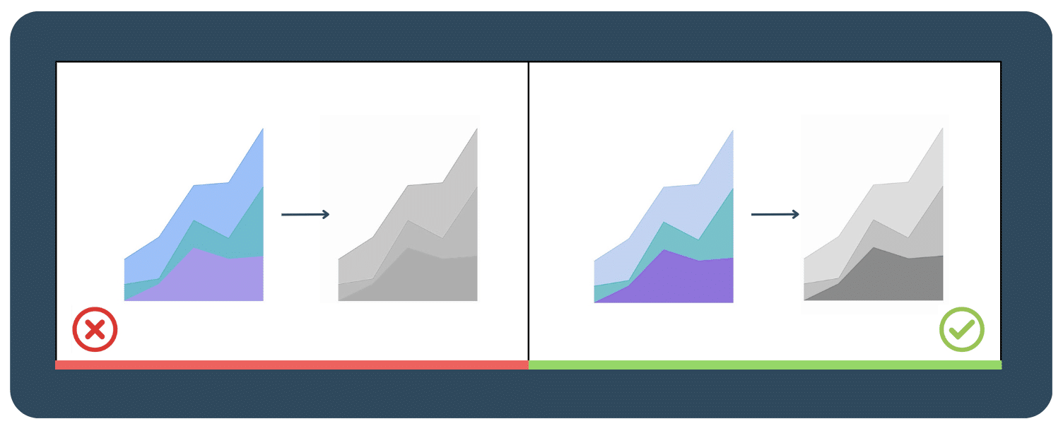
 Don’t get too crazy with the colors, choose a few and stick to them
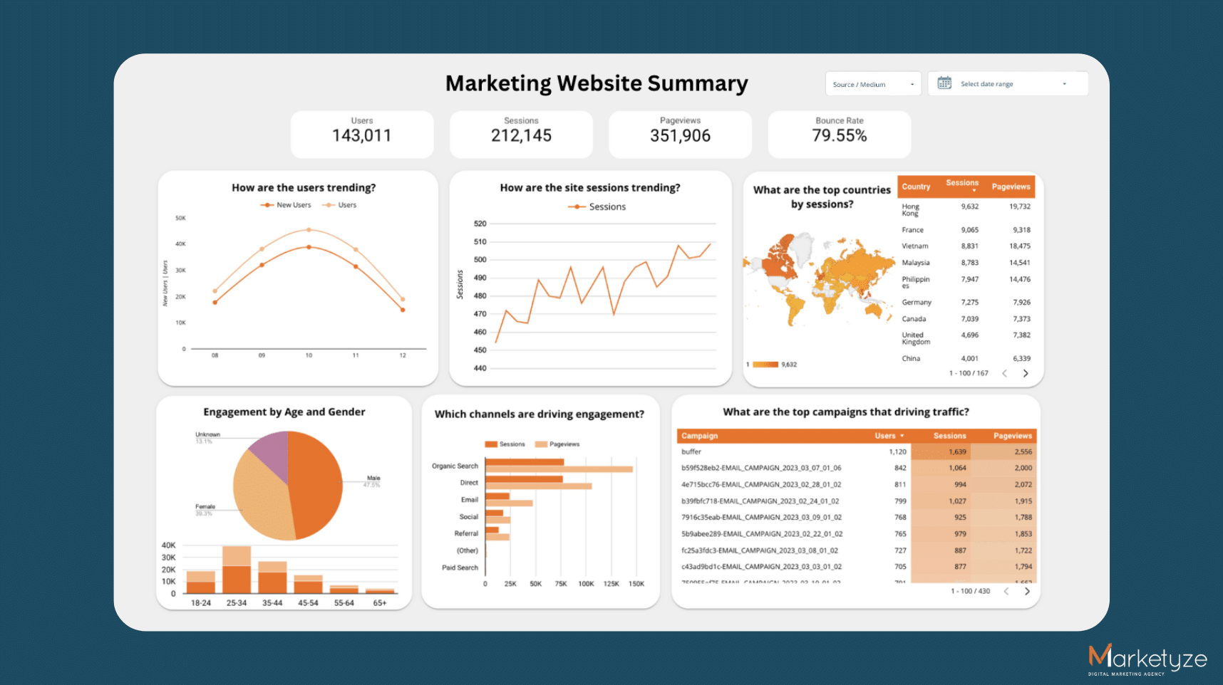
 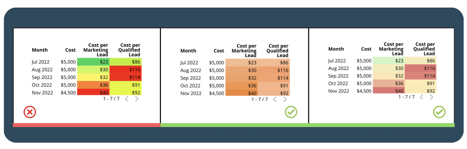 If we added adjustments to our dashboard using the ground rules and color principles, here is our Dashboard v2.0!
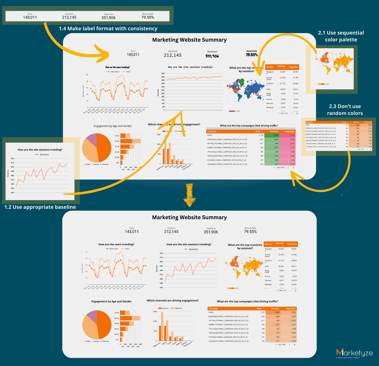
 Use a horizontal bar chart instead of rotating the labels
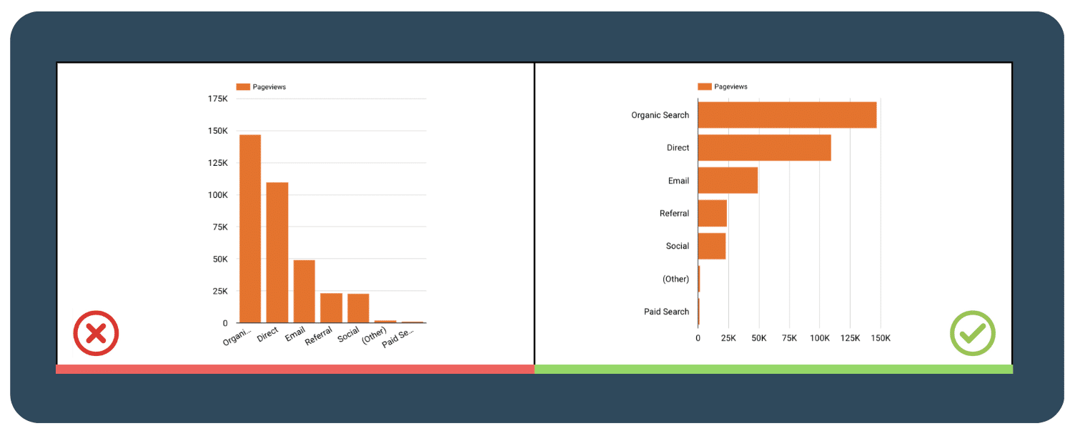
 Label directly on the chart
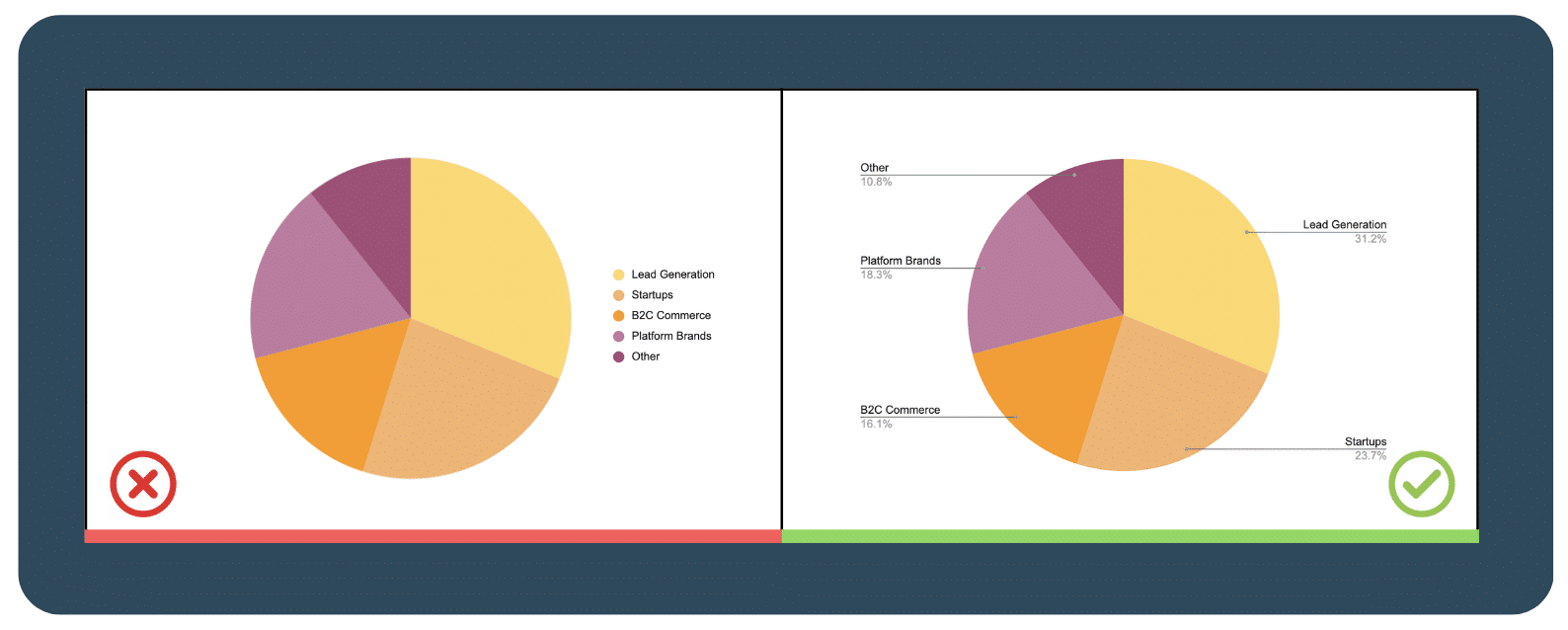
 Avoid confusing dual axis
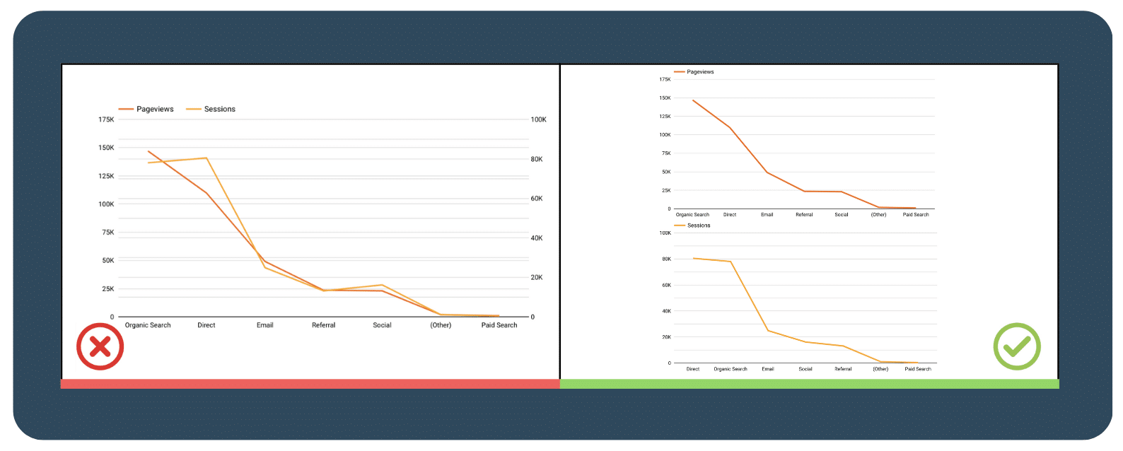
 Content grouping
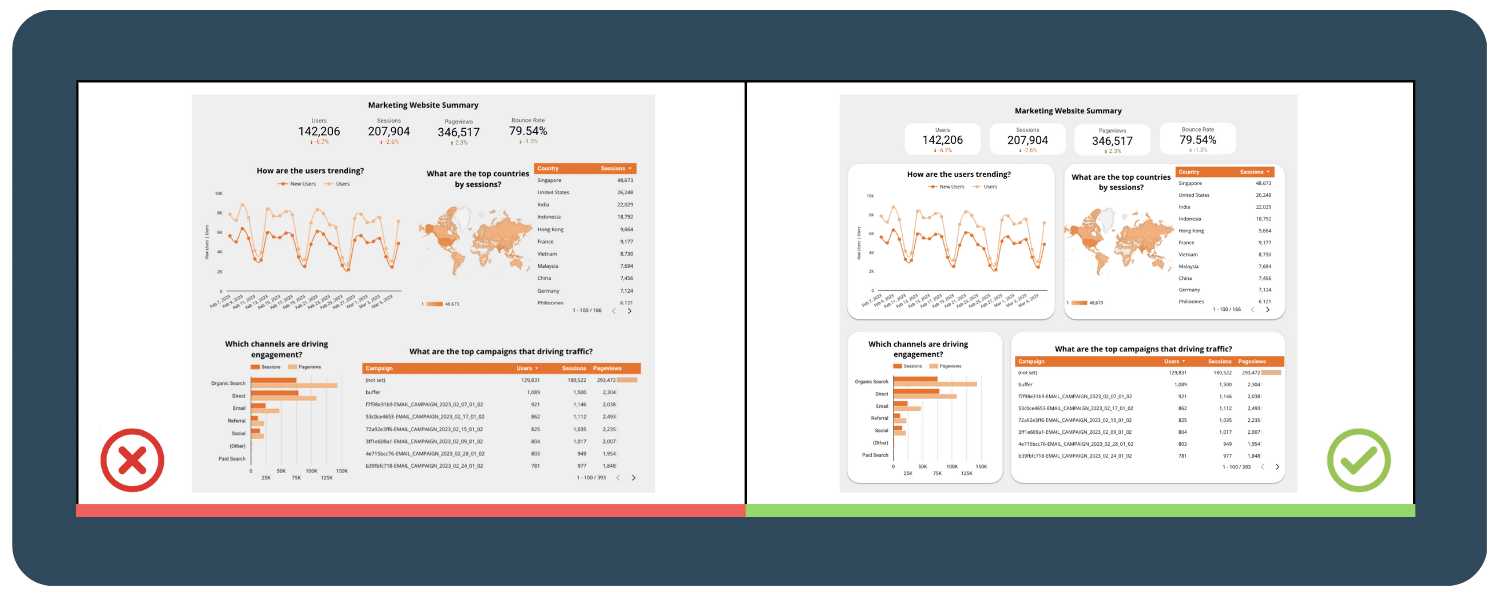
 Don’t overlook spacing
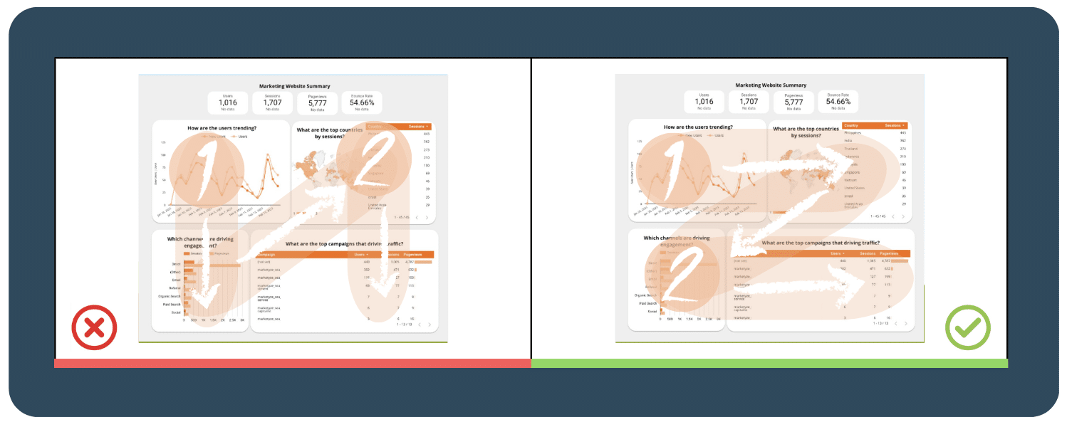
 Add dashboard filtering and sorting capabilities for a more user-friendly experience
 Use a time interval widget
 Include the option to drill down for more information
  Spreading out across 1 page for each topic
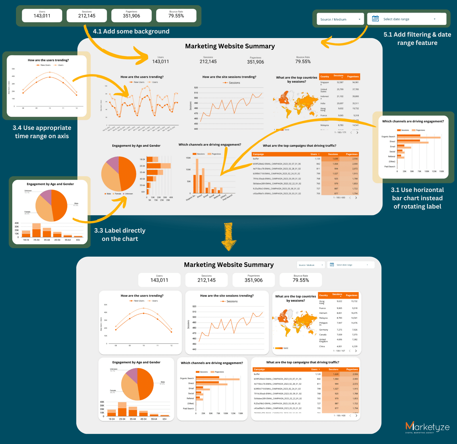


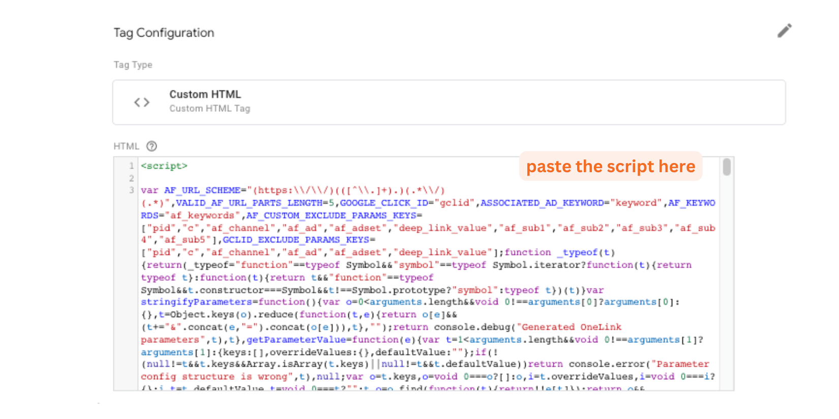
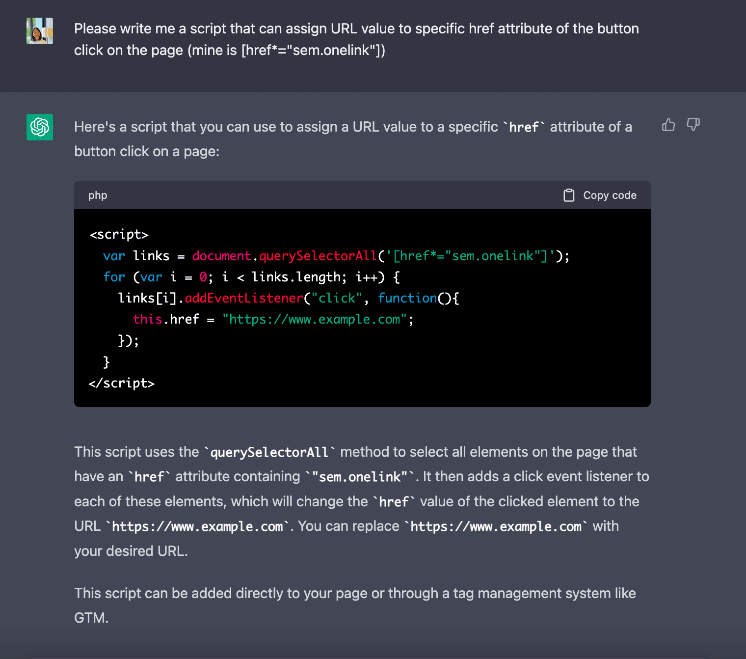
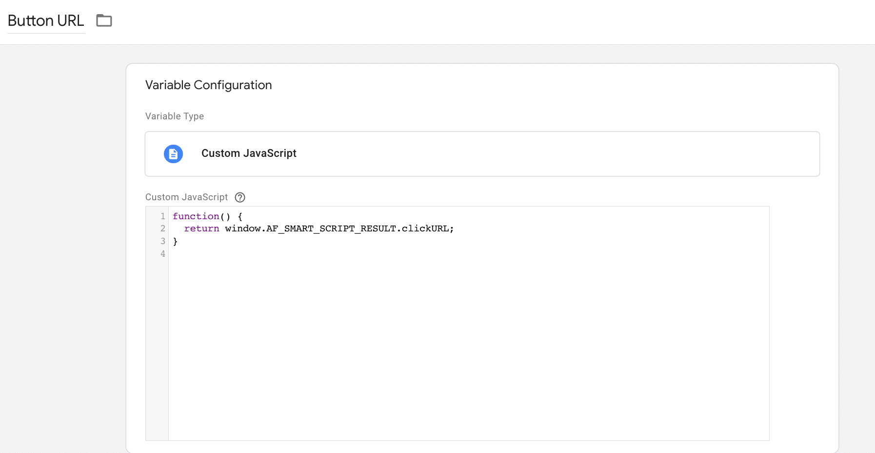
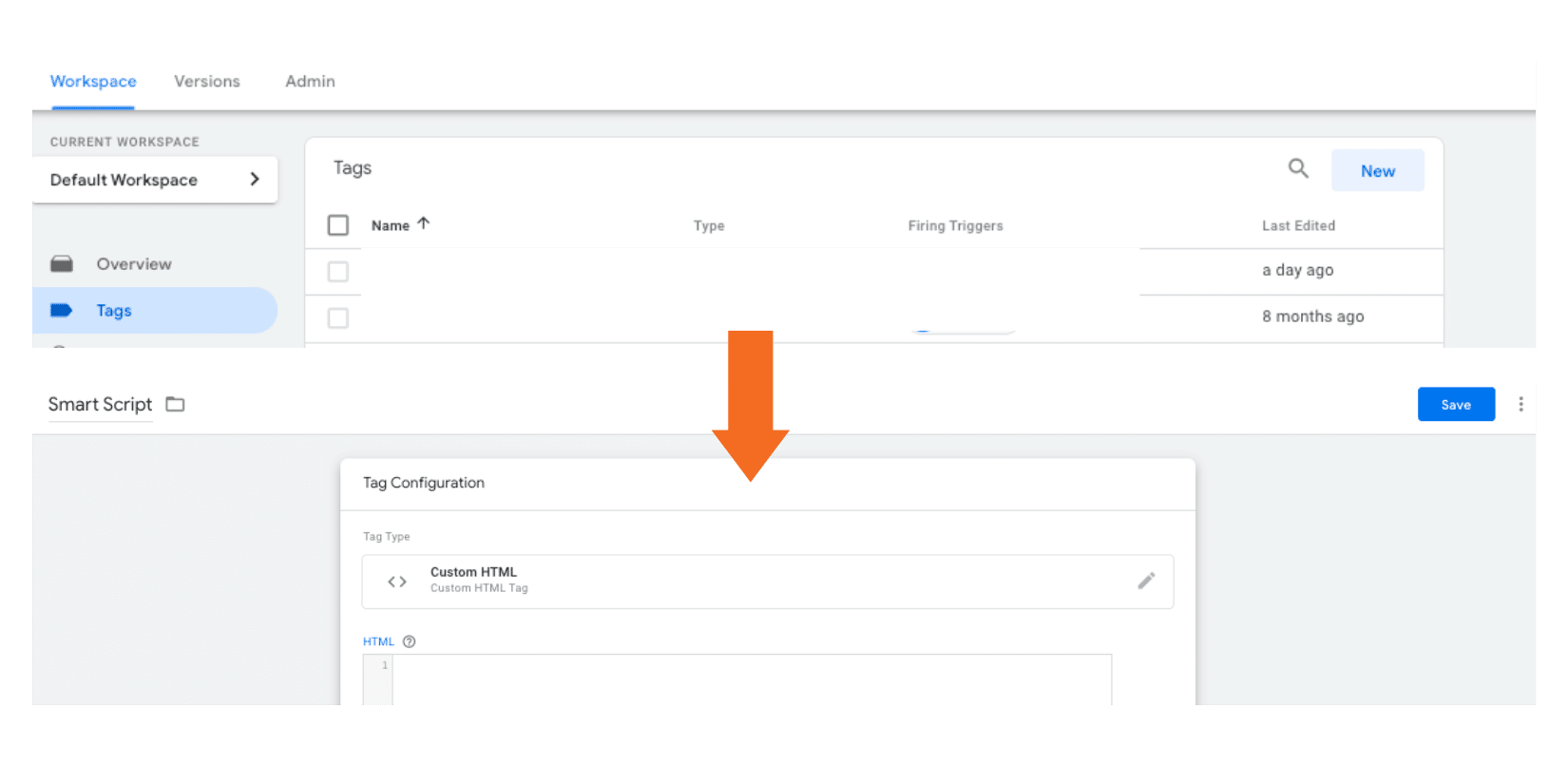 b. In the HTML box, paste the generated AppsFlyer’s Smart Script code.